Understanding Community Visualizations in Data Studio

In this blog article, we'll show you some examples of community visualisations and explain how the process is carried out.
As well as a significant number of Partner Connectors that have already been filed and approved, Data Studio includes pre-installed connectors to other Google products (such as Google Analytics, Google Search Console and more), allowing you to connect to nearly any data source with relative ease. Even if a connector for your application does not yet exist, there is an API for it, which expands the options even more. Talking about APIs, Data Studio has now thrown open the door to a whole new universe of advanced visualization possibilities.
Google has provided this freedom through its community program, which allows both individuals and businesses to contribute Community Visualizations to the Google Search results page. With the introduction of this new library, the possibilities for highly interactive data elements are as numerous as the technologies that it incorporates, namely JavaScript and CSS.
These are formal, defined methods for bringing in your own data or creating your own visualizations, and if you're ready to share them with the greater Data Studio community, you can do so here. In a way, it's a thrilling way for the tool to continue to expand organically, at a pace that can be significantly faster than the formal product review and additions at Google.
Anyone may create, use, and share custom visualizations in Google Data Studio thanks to the Data Studio community visualizations feature. The charts in this category are designed by third-party developers to work with your data and can be modified in the same way that Data Studio's default charts can.
These features are primarily comprised of graphs, tables, and data filtering options. To develop custom dashboards that work in Data Studio the same way as the native visual elements, you can combine and match visual components from different sources.
“Data Studio community visualizations allow you to create and integrate custom JavaScript components into your dashboards. You can use community visualizations to expand your chart selection, customize your report styling, or create custom components that perform advanced analysis.” - Yulan Lin (Google Developer Advocate)
How to add a community visualisation to your report
About the consent
💡 The data from your data source is displayed in the community visualizations. Despite the fact that the community visualization does not have direct access to your data, you should make certain that you trust the developer of any community visualizations you include in your reports.
If you do consent; all components in the report based on the community visualization are able to show data. You can revoke your consent at any time.
If you don't consent, all components in the report based on the community visualization show only the consent request. They won't show any data.
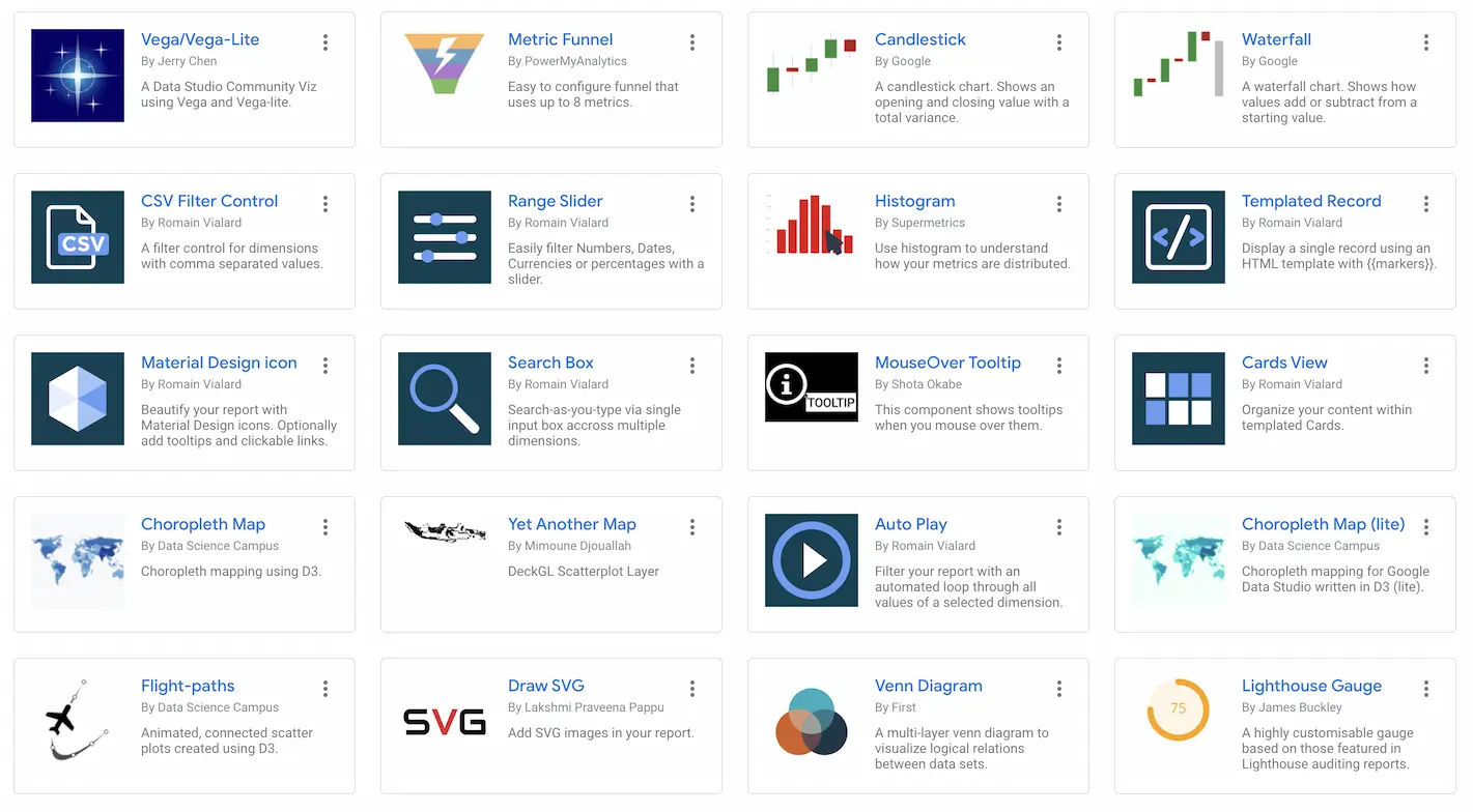
Example Community Visualizations in Google Data Studio
Among the many community visualizations that have been built and distributed to date, we will showcase our top five favorites in this area. To allow you to see the visualizations for yourself, we have also created a report with example data that you can download.
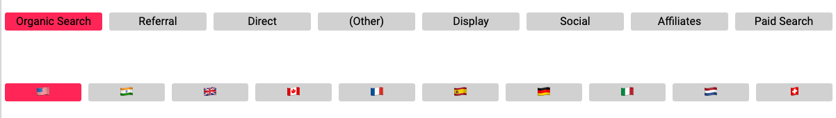
Super Selector from Supermetrics
The Super Selector, which was developed by well-known Data Studio partner Supermetrics, allows the end-user to filter the data they wish to view in the report in a straightforward and visual manner. Alternatively, if the end-user would benefit from being able to view the data in a Google Analytics report by the visitor's nation, or by marketing channel, then this visualization would be appropriate. In our sample report, we've included these two dimensions as well. According to the example above, numerous super selectors can even be integrated into a single webpage, allowing users to do multidimensional filtering.
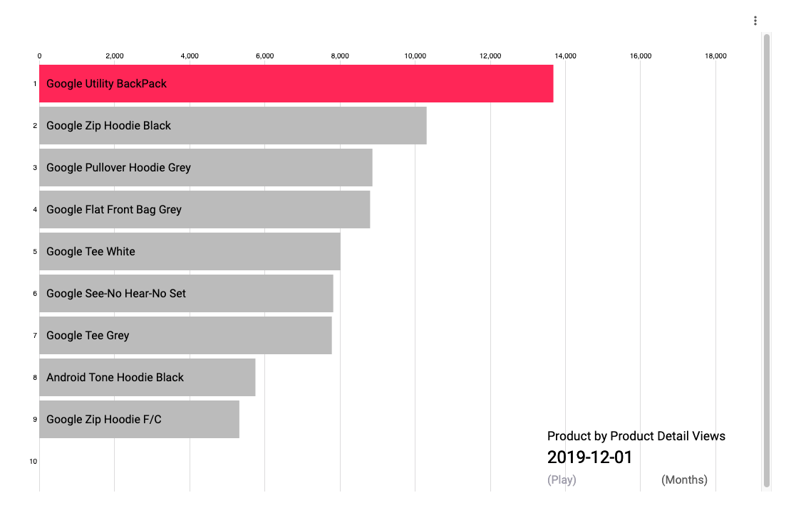
Animated Bar Chart
An great method to demonstrate how the values for a dimension have changed or accrued over time is to use a chart like this. The graphic displays an animation of the values for each day, week, and month for the calendar range that has been specified. In our illustration, we demonstrate how the top ten most popular products change over time. In addition, the chart can be configured to display the cumulative amount over time. Users can choose whether this is displayed day by day, week by week, or month by month based on their preferences.
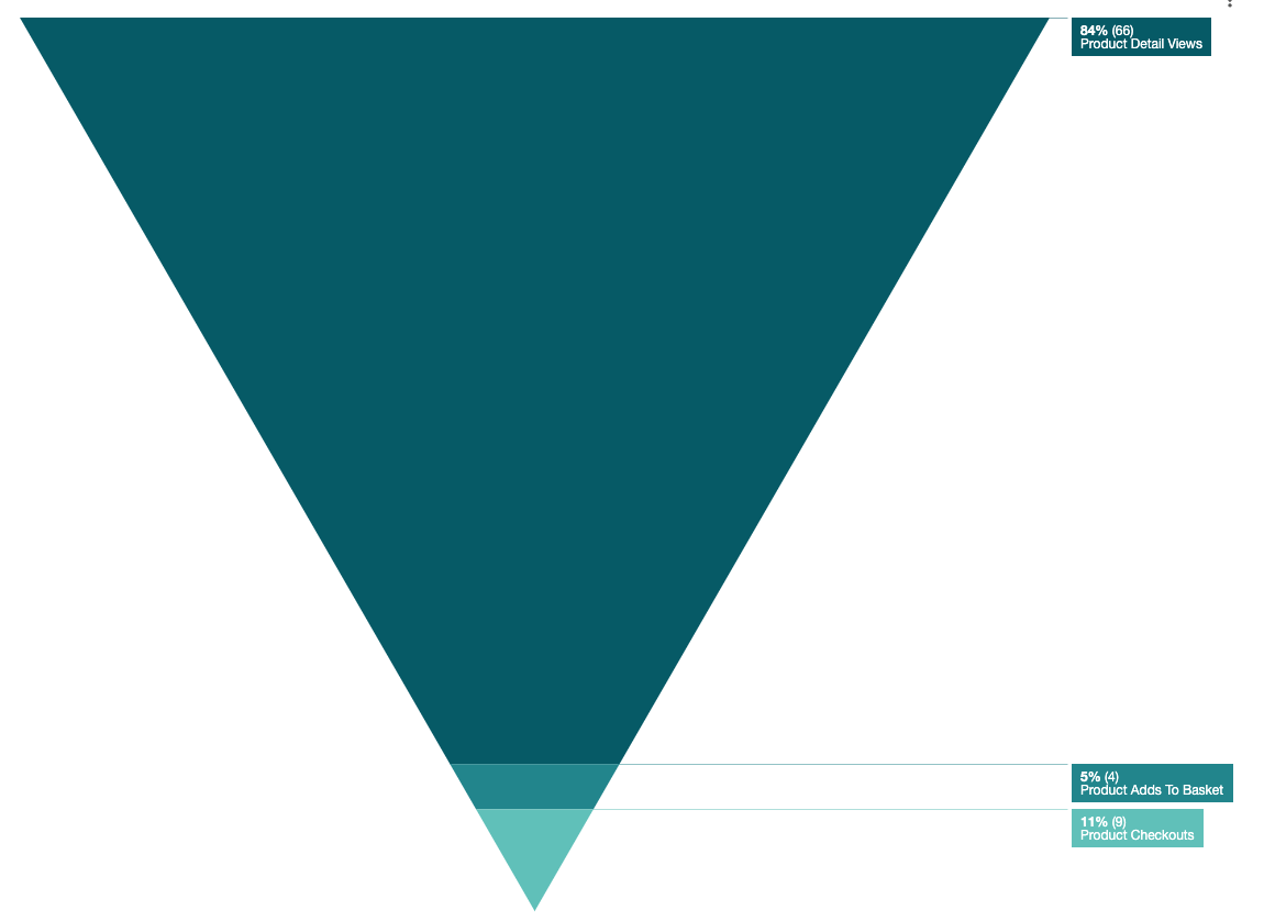
Funnel Chart
This straightforward and handy chart allows for the visualization of a conversion funnel, allowing for the comparison of each step of the conversion process. Before the community visualizations made it feasible to add this chart type, a large number of users had requested that it be included. In our example, we have depicted a conversion funnel for an ecommerce website.
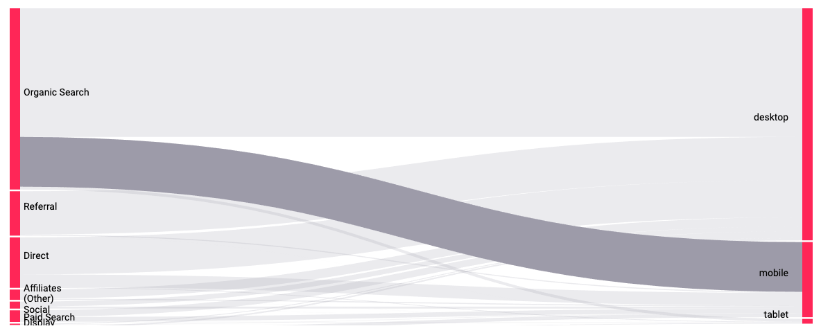
Sankey Chart
As a type of flow diagram, Sankey charts are dynamic, meaning that the width of each segment varies in reaction to the flow of information through them. This chart depicts a metric that connects two dimensions and allows you to see how the metric is divided across each category of the two dimensions. To illustrate, we have used the number of Sessions as the measure and the dimensions Channel and Device, both from Google Analytics. Using the chart, we can immediately observe how much traffic comes in through each channel and from each individual device. In the following example, we have highlighted the percentage of sessions on mobile devices that arrived at the site from organic search results on Google.
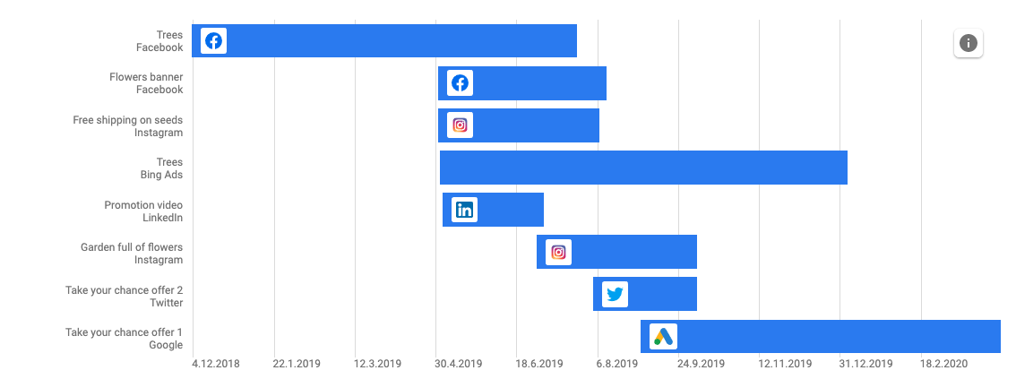
Gantt Chart
This graphic, which is also provided by Supermetrics, allows the user to see the progression of their marketing initiatives over time. This is useful in determining the impact of various marketing strategies on the bottom line. It can then be used to filter the information contained within the report.


![Working with Google Data Studio Filter [Guide]](/content/images/size/w720/2022/02/Filters.svg)

