Google Data Studio Introduction

Google Data Studio is an online data visualization platform from Google that allows you to create charts and reports from various data sources.
This article will give you a basic understanding of how to get started with Google Data Studio.
What is data visualization?
Data visualization is an interpretation of raw data with visual elements such as charts, scorecards, pie charts and many more.
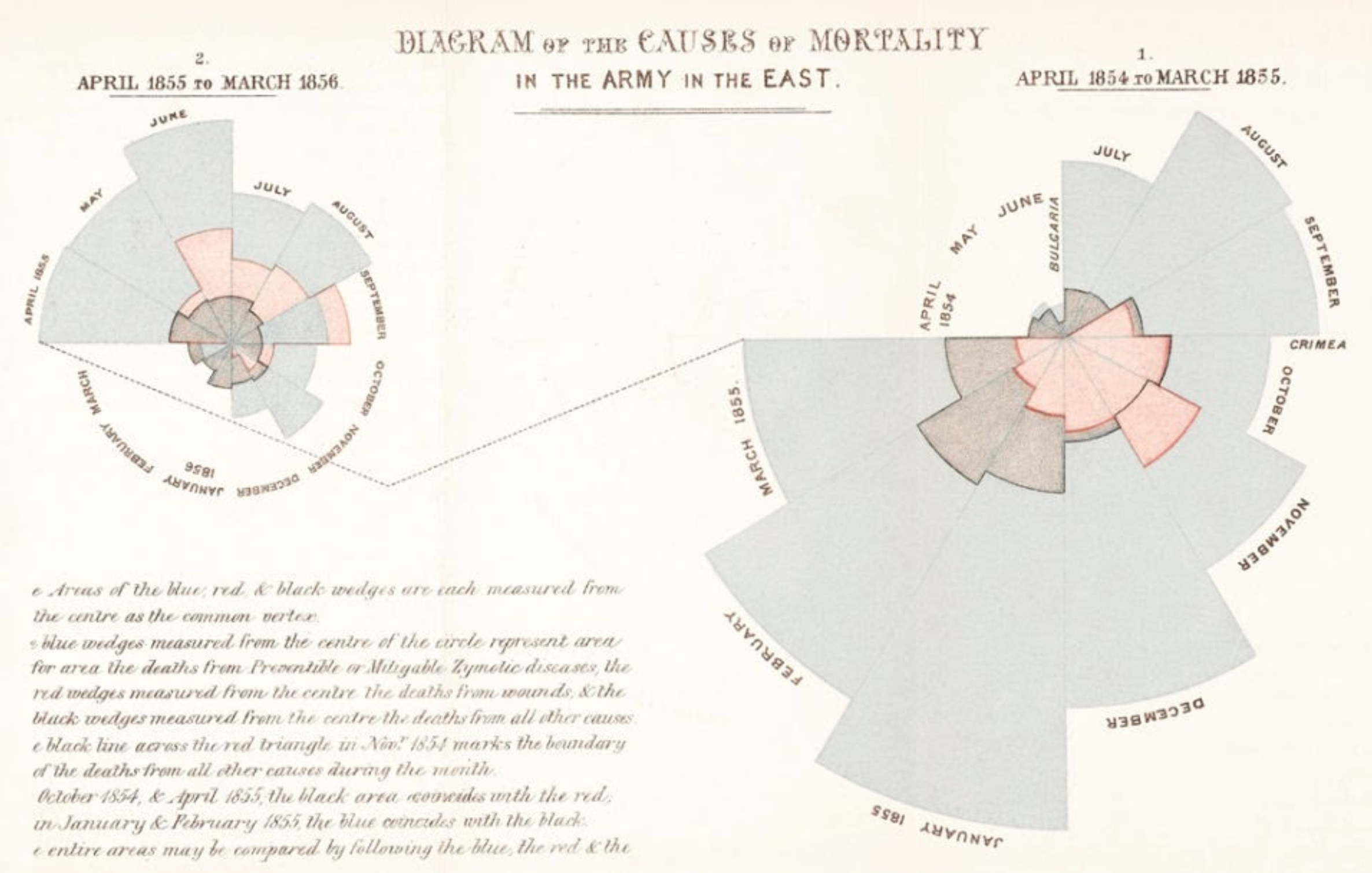
As the raw data to which we are exposed, has been growing enormously every year, the need for a better communication medium has become a must. But data visualization is not something new. In fact, Florence Nightingale was using polar charts to show trends and volume of soldier deaths during Crimea War in 1850s. We can say that we prefer charts to numbers!
What is Google Data Studio?
Google Data Studio is one of the most popular data visualization tools and getting more popular every day. It is very versatile and comprehensive when it comes to reflecting your data in a more intuitive and easy to understand manner.
Data Studio is one of the numerous Google Marketing Platform products that allows marketers to generate complete visual reports and dashboards based on their data. As you know, we use Google ecosystem products for a variety of projects, such as tracking SEO with Analytics and developing paid search ads with Google Ads. And Google Data Studio connects to these several platforms out of the box but also allows 3rd party connectors to offer many other connections.
Google Data Studio Alternatives
There are several alternatives when it comes to creating dashboards and visually appealing reports. Below you can check some of the most popular tools which can be alternatives to Google Data Studio. You might also check our related article here: Google Data Studio vs. Tableau: What's Better for You?
- Tableau
- Microsoft Power BI
- Klipfolio Dashboard
- Metabase
All these tools offer similar services with small differences. There are technical capabilities and also paid/free options as well.
Creating a Google Data Studio Dashboard
Let’s step into the dashboards world and create our first Google Data Studio dashboard. After all, who wouldn’t want such designs to read their data?

How to create a dashboard?
In order to create a Google Data Studio dashboard, you will need a Google account. You can login to the Google Data Studio panel from https://datastudio.google.com/ . More on how to create a Google Data Studio account can be found in this tutorial. When you log in first time, you will see such a panel:

Here, clicking on the big plus sign under “Start a new report” will open a new dashboard. The next page is your first dashboard! Now, Google will invite you to choose data sources. We will discuss it in our next topic.

How to connect data sources to your dashboard?
As you can see from the screenshot, the next step in our dashboard creation is connecting data sources that we’d like to interpret in our report. There are tens - perhaps hundreds - of connectors that can connect almost any data to your report. There are 2 main types of data sources;
- Google connectors
These connectors are offered from Google and they are actually Google Cloud products such as Analytics, Ads, Search Console etc. They are free of charge and they are very reliable and fast almost always. - Partner connectors
Partner connectors are 3rt party connector software which are written and maintained by developers and software companies. These help us connect data from sources which - usually - are not covered by Google connectors. Such as; Facebook Ads, TikTok Ads, Amazon etc.
How to create charts and visual elements in Google Data Studio?
After connecting your first data source, usually, Google automatically adds a table chart to your dashboard.
You can select it by clicking on it once and then deleting it with the backspace key. To add a new chart, you should click on the “Add a chart” button (1). From the opening drop-down menu, you can click on the desired visual element. This adds it to the report right away.
After that, you need to choose dimensions (2) and metrics(3) which will bring related data and values to the chart. In the below example, page title is the dimension (left column in the chart) and number of new users is the metric (right column)

How to change Google Data Studio dashboard branding, colours and design?
One of the best traits of Google Data Studio is the option of changing colours, fonts and other styling elements. This helps us to create custom designs according to our desire or perhaps aligned with our company brand.
In order to make such changes, there are 2 main options;
- When none of the charts is selected, you will see the “Theme and layout” pane on the right. From that section, you can choose between themes, customise one of the themes or the “layout” tab, you can customise even deeper.
- When any of the charts is selected, you can click on the “Style” tab on the right of the page. This section only allows you to change the colours and font of that specific chart and overrides themes style settings.
Reporting
There are several ways of reporting.
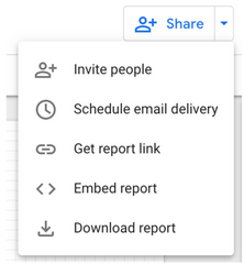
- Sharing URL to the dynamic dashboard.
By clicking on the “Get report link”, you will get a link to your report and you
can send by e-mail or messaging platform. Depending on the sharing settings, URL recipients might only see or interact with the report. - Downloading a PDF copy.
By clicking on “Download report” you will get a PDF file. This is going to be a static report with the selected date or data selector and the viewer won’t have a chance to interact. - Scheduling a report.
Scheduled reports will send an e-mail to the selected recipients with an URL and PDF file. This function is very handy with periodic reports. - Embed report.
By clicking “Embed Report”, you can embed a dynamic report to your personal or company page. As this is an HTML based report, the viewer will be able to interact with the report according to your settings.
Pricing
Is Google Data Studio free? Yes, it is! You will just need a Google account to use it even for your business. However, please keep in mind that partner connectors are usually extra and you will need to purchase them separately.
You're ready to produce spectacular interactive reports for your teammates, clients, and executives now that you know Data Studio inside and out.


![Working with Google Data Studio Filter [Guide]](/content/images/size/w720/2022/02/Filters.svg)

