Google Data Studio Scatterplot & Bubble Charts

Data Studio has plenty of data visualization components that can help to create stunning dashboards.
In this post, we'll explain how to create the scatterplot and bubble chart.
Data Studio offers a variety of visualisations, such as graphs, charts and table options, along with options to help you modify and interpret your data in accordance with your business goals and goals. If you're only beginning to get acquainted with Data Studio, check out this tutorial to learn how to use it.
Selecting the most effective visuals to convey your message is essential to creating an effective Data Studio dashboard, but sometimes it's a challenge. It is likely that you reach for certain types of charts more frequently than others, such as line charts, tables and bar graphs.
But, bubble and scatterplot charts appear to receive less attention and could be under-utilized. If you're prone to skip over these types of charts Let's consider possible scenarios to think about for your next dashboarding venture.
Scatterplot & Bubble charts are for comparing variables according to relationships between them. Charts might have points or circles. Charts have X and Y axis.
Scatter charts help see the relationship between 2 metrics for up to 3 dimensions. For example, a scatter chart can show if there's a correlation between ad spend and conversion rate for a specific campaign, letting you answer questions such as "Do more expensive ads result in better conversions?"
Bubble charts show data with 3 dimensions. It's similar to a scatter plot where the first 2 dimensions are the horizontal (X) and vertical (Y) coordinates, but it adds a 3rd dimension which is represented in the chart as the size of the bubble.
Scatterplot and Bubble Charts Examples
Scatterplot Chart
The left example compares the average course completion rate with the average activity rate (a measurement of how engaged the students were, in terms of forum posts, class activities completed, etc.) There is also a trendline that goes upwards. This shows there is a positive relationship between activity rate and completion rate. I.e., the more engaged the student, the more likely they are to complete the course.
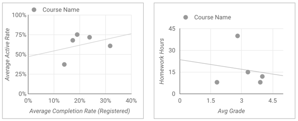
The right one compares the average student grade with the number of hours of homework for each course. There is also a trendline that shows - that the less homework assigned, the better the average grade.
Bubble Chart
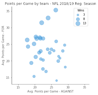
Let's take the below table as our data. It would look confusing at first glance.
| AVG_POINTS_AGAINST | AVG_POINTS_FOR | WINS |
|---|---|---|
| 26.56 | 14.06 | 3 |
| 26.44 | 25.88 | 7 |
| 17.94 | 24.31 | 10 |
| 23.38 | 16.81 | 6 |
| … | … | … |
We can use a bubble chart to represent these 3 columns of data, easier and let's say more enjoyable.
Scatterplot vs. Bubble Charts
At first glance, scatterplot and bubble charts can look similar and you might start to ask what are differences between a scatterplot and a bubble chart.
The scatter graph's x axis displays one field of numerics, and the y-axis displays a different one which makes it easier to understand the connection between the two fields for every item within the chart. For a bubble graph an additional numeric field is used to control the dimension that the points in data.
We recommend bubble charts especially when you have more than 2 metrics.
How to Add a Scatterplot and Bubble Chart in Google Data Studio
Scatterplot and Bubble Charts can be added like any other element on Google Data Studio. The first thing you should do is to click on “Add a chart” and select one of the “Scatter” charts. Make sure that you select your desired data source and add metrics and dimensions.
Chart Settings
Click on the chart, afterwards on the right, use the properties panel to change the chart options.
Data Tab
This tab shows settings related to the data source.
- Data source: A data source lets you connect to the data set you want to use. Data source options are: change the data source, view/edit the data source, add a blended data source. If you can't find the data source you are looking for, you can check this tutorial about how to ad a data source to Google Data Studio.
- Dimension: Dimensions are categories for your data, and dimension values are a name, description or another characteristic of a category. You can choose dimensions either directly from the available fields or by clicking the "Add Dimension" link. Dimensions may differ according to cart types. For example, geo charts' dimensions will be only locations.
- Drill down: This option appears in the chart that supports it. Drilling down gives viewers a way to reveal additional levels of detail. When you turn on Drill down, ****each dimension you add becomes another level of detail you can see. Here is an example of how drill down works;
- Metric: Metrics are used to measure the contents of dimensions and provide the chart with a numeric scale and data series. Drag fields from the Available Fields tab on the right onto the chart to add measurements. You can also click Add metric in the Data tab.
- Metric X: The X (horizontal) axis metric (e.g. Avg Grade in the right-hand example above).
- **Metric Y:**The Y (vertical) axis metric (e.g. Homework Hours in the right-hand example above).
- **Bubble Size:**Setting this causes the chart to display as a bubble chart. This metric determines the size of the data points.
- Metric Slider gives the viewer an option to filter desired metric value to view. For example, you can limit the chart to only show Average Orders where the total value is between $100 and $200. (not all charts offer this option)

💡At least 1 metric is required. You can have up to 20 metrics in a single-dimensional graphic. One metric can be used for charts with two dimensions.
Setting the default sort: The Sort and Secondary sort options control the default sorting behaviour. You can select any metric in the chart's data source, or any dimension currently displayed in the chart, to use as the primary or secondary sorting field. The Secondary sort option only appears when there is an appropriate combination of dimensions and metrics in the chart.
Default date range: This lets you set the timeframe for an individual chart*.* When this is changed, this specific chart's date range overrides the date range of the page. Default date range options:
- Auto: Applies the date frame of the dashboard if there is a data selector. If not, then tries to include all data.
- Custom: This Lets you use the calendar widget to select a custom date range for the chart.
- Date compare type: Displays comparison data for the selected time period.
Filter: Filter help filter the raw data which is coming from the data source. It might be helpful when you want to include specific values or exclude some. For example, you might want to exclude ad campaigns with zero impressions.
Google Analytics segment: This option appears for charts based on a Universal Analytics data source. A segment is a subset of your Analytics data. You can apply segments to your Data Studio charts to help ensure that your Data Studio and Google Analytics reports show the same data.
Style tab
A chart's style properties control the overall presentation and appearance of the chart.
Colour by: Here you can change colour settings.
Reference lines: This lets you to compare your data to a reference data. For example, you can use reference lines to visualize daily sales against a target sales figure.
Trendline: Adds an additional line to show the trend in the change of metric values. A linear trendline is a straight line that most closely approximates the data in the chart. If your data is best explained by an exponential of the form eax+b, you can use an exponential trendline to show the direction of your data. A polynomial trendline displays data directionality as a curved line. It can be useful for analyzing large, highly variable data series.
Axes: These options control the display of the chart axes titles and scales. A right Y-axis section appears when you have more than 1 metric in your chart.
- Show axes: Shows or hides the chart axes.
- Reverse Y-Axis direction: Controls the vertical display of the Y-axis.
- Reverse X-Axis direction: Controls the horizontal display of the X-axis.
- Show axis title: Shows or hides the axis labels.
- Axis min and max: Set minimum and maximum values for the Y-axes.
- Custom tick interval: Controls the interval between axis ticks.
- Log scale: Makes the Y-axis scale logarithmic.
Grid: These options control the look of the chart grid.
- Axis colour: Sets the colour of the x-axis line.
- Grid colour: Sets the colour of the grid lines.
- Chart Background: Sets the colour of the chart background.
- Chart border colour: Sets the colour of the inner chart border.
Background and border: These options control the appearance of the chart background container.
- Background: Sets the chart background colour.
- Border Radius: Adds rounded borders to the chart background. When the radius is 0, the background shape has 90° corners. A border radius of 100° produces a circular shape.
- Opacity: Sets the chart's opacity. 100% opacity completely hides objects behind the chart. 0% opacity makes the chart invisible.
- Border Color: Sets the chart border colour.
- Border Weight: Sets the chart border line thickness.
- Border Style: Sets the chart borderline style.
- Add border shadow: Adds a shadow to the chart lower and right borders.


![Working with Google Data Studio Filter [Guide]](/content/images/size/w720/2022/02/Filters.svg)

