What is a heatmap?

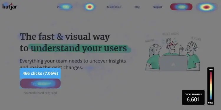
Heat maps are graphical representations of data in which values are represented by color, making complex data easy to view and understand at a glance. Although heatmaps can be created by hand, most modern heatmaps are created using specialized heatmapping software.
Heatmaps are visual representations of user reactions on various pages of your website that enable rapid analysis. They help you collect visitor behavior insights, which you can then use to tailor your website better to meet visitors' expectations, such as increasing conversions, lowering bounce rates, or increasing sales.
In other words, heatmaps are a quick and easy way to contextualize aggregate user trends for any web page.
Why we are using heatmaps?
They're commonly used to reveal clicks and taps on a web page, with each page element color-coded based on its popularity. The factors that have been clicked or tapped the most may appear bright red, while those that have been clicked or touched the least may fade to cooler colors.
On websites, heatmaps are used to identify user behavior and assist you in improving your site. Heatmaps, for example, make it easy to see high-level user behavior: if no one is tapping one of your most important page elements, it's a sign that you need to redesign to increase engagement.
Colour Schema Types
Heatmaps can be created using a variety of color schemes, including grayscale and rainbow. However, because humans can distinguish more colors than grayscale, rainbow-themed maps are frequently used (though there are drawbacks).
Warmer colors, such as reds and oranges, represent "more frequently used" or "more popular" areas of your map, while cooler colors, such as blues and purples, represent "less frequently used" or "less popular" sections.
Types of heatmaps
Furthermore, various heatmaps can help you understand various aspects of your website. A click map, for example, displays the most frequently clicked elements on your website, whereas a scroll map displays how far down users scroll on a specific page. Incorrect click maps, dead click maps, and other types of click maps are also available.
Click Maps
One of the most common types of heatmaps, click maps, show you where visitors clicked on your page, providing insight into how people interact with your website or a specific page. You can use click maps to see which elements on your site receive the most or least minor clicks, revealing navigational issues.

Click maps can help you improve the return on investment of your website by placing and monitoring effective CTA buttons, identifying and removing locations that cause user friction and raise bounce rates, revealing which portions of your site are most popular, and monitoring conversion rates for new and returning users.
However, there are a few things to consider when using click maps. Improper analysis can be caused by various factors, including accidental logins, frustrated clicks that distort data analysis, and other issues caused by browser/device incompatibilities, among others.
Visitor click maps, like any heatmap, must be linked with other data—data points from product analytics tools, Google Analytics, UX surveys, and so on—to gain a complete picture of why people behave the way they do.
Scroll Maps
Scroll maps, like click maps, are visual representations of visitors' scrolling activity on a web page. Scroll maps reveal the following information:
- How many people scrolled all the way to the bottom of a page?
- How many people scrolled down a page but didn't go all the way to the bottom?
- How many visitors did not complete a page?
- What percentage of people scroll to a specific depth on a web page? (For example, 34% of visitors scrolled 50% of the way down a page, 13% of visitors scrolled to the bottom, and so on.)
Knowing how far the average visitor scrolls before leaving can help determine the length of your web pages, and it can also help you decide where to put information on a page.
If only 25% of visitors scroll below the fold (the point where your screen cuts off the rest of the page) on a page, you know you need to put the most important content at the top.
Scroll maps can also help you determine if your website has a false floor (or false bottom), which happens when users believe they've reached the bottom of a page but haven't.
When using scroll maps, consider metrics for desktop, tablet, and mobile platforms.
Scroll maps can help you understand how to modify a page to maximize its impact by revealing if important content is being overlooked.


