7 Simple UX Design Tips

Here are some things to think about if you want your website or mobile app to be user-friendly:
- [ ] The form only requests basic lead information from the user.
- [ ] The length of the form is not intimidating to the user.
- [ ] The links are working.
- [ ] The page is simple to use.
- [ ] The page speed has been improved.
- [ ] On multiple devices, the page is mobile-friendly and responsive.
- [ ] The page's length is ideal.
- [ ] There is a 'Thank You' page that goes over the next steps after the conversion.
- [ ] Unwanted distractions have been removed.
1- Make Sure Important Actions Are Quickly Selectable
Consider reorganizing your website or app to make the main sections more visible at all times if you want to help people find things faster.
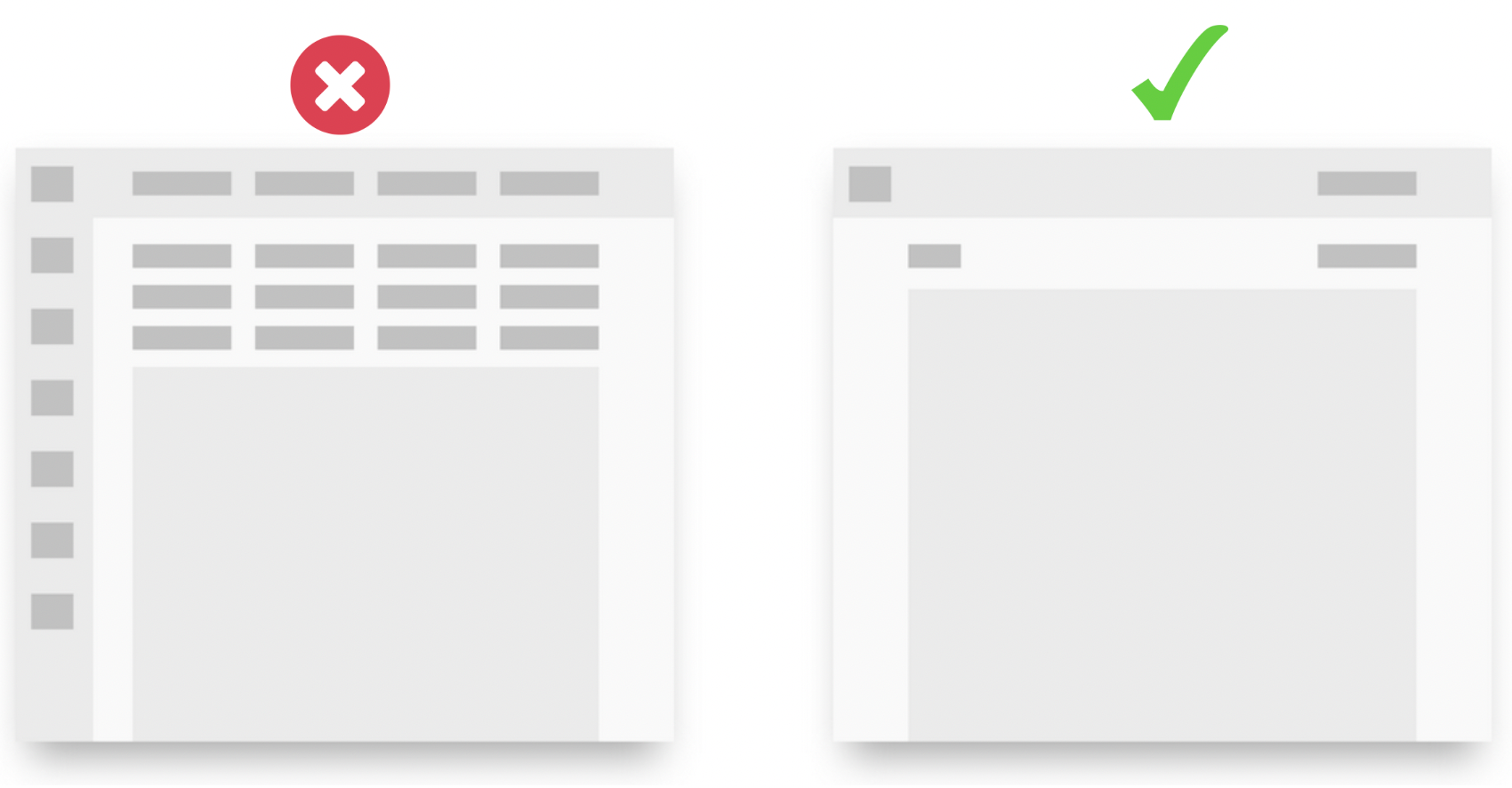
2- Simple Design
You may want to display critical actions on the same screen. However, the maximum number of options the human eye can detect is nine. Identify the essential steps; if there are more, try grouping them under the other actions.
3- Users Don't Always Hate To Scroll
According to studies, users avoid scrolling, especially as our attention spans shorten. Scroll map analysis can be used to determine the status of your website. However, this does not always imply that users despise scrolling.
Yes, users want to find what they're looking for quickly, which is an obvious truth. However, you do not have to show everything in the folding field to provide them with the required information. You are responsible for ensuring that users can scroll comfortably on your site with your design.
4- Be Careful About Dropdown
Dropdowns are remarkable in a variety of ways. However, if you use it frequently, your users may find it boring and ineffective. There is a minor way around this. If you have five or fewer options, display them openly.
Of course, you cannot apply this method while preparing an e-commerce menu. But other than that it will perform much better.
5- Avoid Over-Explaining
If you are not a content website, you should know how to direct your users to stay on the site with less content. Because mobile websites have much less space, you should be extra cautious about the content you include.
“Get rid of half the words on each page, then get rid of half of what’s left.” (Steve Krug’s Third Law of Usability from Don’t Make Me Think!)
6- Whitespace Power
Make sure to leave enough white space for users to read your content. It is not required that the color be white. This entails leaving the appropriate areas.
This rule applies to all websites but is essential for content websites.
It is critical to design content areas that users can read without becoming bored, and medium is an excellent example if you're looking for one.
7- PopUp Terror
If you don't need to use a popup, don't. Popups are functional designs for making things stand out. However, they can be disastrous when abused (as with many websites).
If you absolutely must use it, consider the following:
- Do not use two popups in a row.
- Make sure the close button is big enough.
- Don't show it as soon as the user enters the site.
- If the user has closed it once, do not show it again after a few seconds.