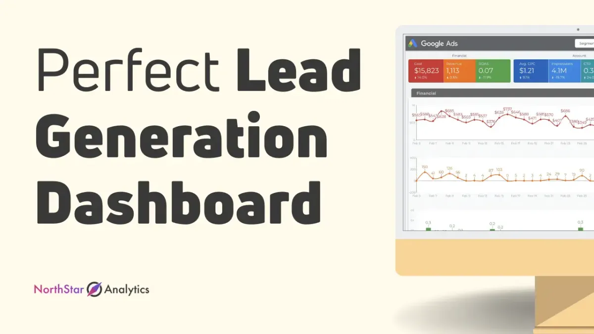
Lead Generation Dashboard
Have you ever thought that there was a way to measure the performance of your lead generation quickly? There is now! The solution is the “lead generation dashboard” (also known as “demand generation dashboard”)
It is possible to set it up to track things such as the number of leads generated over a specific week, and the percentage at which these leads became customers.
In this blog we will go over the following issues:
- What is a Lead Generation Dashboard?
- How to create the lead gen dashboard?
- What should you track in your lead generation dashboard?
- How to create your lead generation dashboard
- Must-Have Charts On Your Marketing Dashboard
- Lead generation dashboard examples
What is a Lead Generation Dashboard?
Nowadays, the growth of businesses is contingent on the creation of new leads on the internet. With a variety of digital platforms that are available, businesses can keep track of the amount they spend and the actions they perform to acquire new leads that are relevant and useful.
The metrics that determine lead generation will decide the next steps in our top-of-the-funnel marketing campaign. These performance indicators (KPIs) are key to determining how effective your strategies are in drawing the attention and the interest of your intended public.
“A lead generation dashboard is a report which shows your key performance indicators related to your business leads, how much you received leads, from where, when etc.”
With this lead generation dashboard, users will have an overview of conversion rates as well as digital marketing channels. The information provided by a leads' metrics display could be utilized to further optimize and evaluate strategies for marketing.
How to create the lead generation dashboard?
A lead generation dashboard that is effective, will increase your visibility into the lifecycle of your lead. Your lead generation dashboard should answer the following questions;
- Are you producing sufficient MQLs (Marketing qualified leads) to support your sales staff?
- Which campaigns are generating the most leads?
- Which campaigns generate the highest quality leads?
- Are there leaky spots inside your lead funnel?
- Where do your leads originate from?
- Are your most important lead generation metrics changing up or down in the past?
If you consider the advantages of being able to constantly examine the progress of your lead's lifecycle and sharing that information with the entire team and colleagues, you'll see that answering these questions could become a million-dollar investment.
There are many dashboards and data visualisation tools out there. After deciding which KPIs is important for your lead cycle, you can choose one of these platforms and move on to creation. Please take a look at our lead generation dashboard templates here.
When you are building a Lead Generation Dashboard, you will need to follow this basic 4-step method:
- Determine the metrics that are important to your lead generation strategies (check below our 8 suggestions)
- Determine where the information is currently stored (a Marketing Automation Platform or CRM)
- Input the information into the dashboard software program
- Make dashboards and data visualizations for your team
What should you track in your lead generation dashboard?
Not sure what lead generation KPIs to be used to determine the success of your outbound and inbound marketing campaigns? This guide will help you decide.
The higher the performance of your KPIs the better sales opportunities you'll be able to make. It's true that it can take hours to analyze and track your KPI reports however the number of leads that are high-quality will make it all worth it.
Top-level KPIs / The Best Lead Generation KPIs
These are the top eight B2C and lead generation KPIs that should be on the top of your list.
Amount of Leads
If there's one measure that affects both sales and marketing teams, it's the number of leads that are qualified. In general, marketing concentrates on marketing leads that are qualified (MQLs). To convert these prospects into leads that are qualified marketers must nurture them through targeted marketing campaigns. If these leads are interested they have deemed Sales qualified leads (SQLs) which is when the team from marketing transfer them onto the person selling.
The number of sessions
The term "number of sessions" refers to the number of new and repeated visits to your site within the period. It is impossible to talk about the number of sessions without also mentioning other important metrics such as bounce rate, and the average duration of sessions. The three KPIs all identify problems within the user's journey.
Engagement
The engagement measure measures the engagement of your prospective customers in your posts (e.g. shares, likes comments, shares). It's commonly used for social media-related marketing. It's also often referred to as an indicator of vanity (spoiler the truth: it's really dependent on the context). Here's a LinkedIn business report that will explain what we mean.
Conversion Rate
The conversion rate is the proportion of people who take an action. The same goes for lead conversion rate, which is the percentage of visitors who are deemed leads. It is calculated by using the formula number of conversions divided by the Total number of visits
The higher the rate of conversion for a lead generation campaign the better. This is a sign the marketing plan is successful.
TIP: If you're seeing an unsatisfactory conversion rate and high bounce rates for paid advertisements, it likely implies there's a mismatch between your ad copy and the landing page's copy. However an extremely low click-through and conversion rate could indicate that the ad's copy (e.g. caption or call-to-action) is in need of improvement.
Note that conversion rate differs from click-through-rate (CTR) which is the percentage of people who click on your blog post go to your site (or landing page).
Total Lead Value
The total value of leads tells you what your leads are worth to your company. Utilize this formula to calculate its total lead value = sales value Because this KPI determines the number of sales you will be able to make so that you can make educated decisions about how you can generate leads.
Customer Acquisition Cost
The cost of customer acquisition (CAC) refers to the sum of money used to gain an additional customer. It allows you to stay in line with your marketing budget and it is calculated according to the formula of Total expenditure on marketing + Total quantity of potential customers. The lower the CAC is, the more profitable it is. It means you're not wasting money to acquire paying customers but at the expense of profit. It is important to ensure that you're earning a good ROI (ROI)
Be aware that CAC differs from the cost-per-lead (CPL) which refers to the amount used to purchase the lead. Another metric that is similar to CAC is the cost per conversion (pictured above) is the total amount of money spent on an event (e.g. fill out the form or download the leads magnet).
Value of Lifetime Value for Customer
The value of a customer's lifetime (CLV or CTV) is the amount of revenue that a business could expect to make from a client during the duration time of the relationship. In order to calculate this, you can use this formula lifetime value* x profit margin * Average amount of sales x the number of sales x retention time
CLTV identifies your best customers. We'd like to say it's among the most crucial factors that influence the revenue. There are many methods to increase CLTV. For instance, if you're part of a B2B marketing company it is possible to upgrade your CRM to provide better customer service or develop an approach to marketing content after-purchase loyalty.
Attribution Channels
Attribution channels identify your best-performing marketing channels. When we say "best-performing," we're talking about things like boosting your sales funnel's conversion rates and closing sales more quickly during the sales process. It's likely that you're not going for success across all channels, and that's acceptable! Choose the channels which work, and then increase your budget.
Must-Have Charts On Your Marketing Dashboard
In this section, we will share 3 basic chart types which are very informative for lead cycle tracking.
Bar charts
A bar chart uses horizontal or vertical bars to show comparisons among categories. The longer the bar, the greater the value it represents. One axis of the chart shows the specific categories being compared, and the other axis represents a discrete value.
Example:
Here are 2 bar charts from the Google Analytics data source. The base dimension for both charts is Medium. The left-hand chart uses stacked bars to show several metrics (Sessions, Users, and Exits) for medium. The right-hand chart uses a second dimension, Country ISO Code, to breakdown each medium
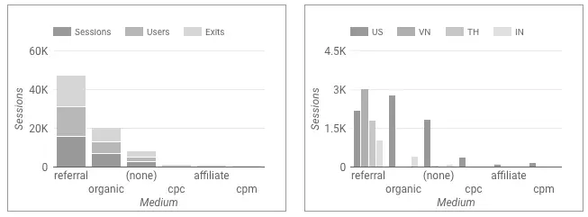
Tip: Bar charts are very helpful when you want to share values over time, such as days, weeks and months. Each bar might represent a day/time and user can easily observe change over time.
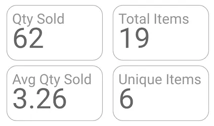
Scorecards
A scorecard is a way to track a single metric that measures the relative health or performance of your business or area of activity. For example, a scorecard tracks total sales, average bounce rate, count of ad impressions, maximum hold time, minimum failure rate and more.
Scorecards in Data Studio appear as numbers, and, optionally, the name of the metric is being summarized. The format of the displayed number depends on how the metric is configured in your data source.
Example:
Let's imagine this is our data source;
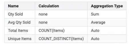
We can have below scorecards from this data source;
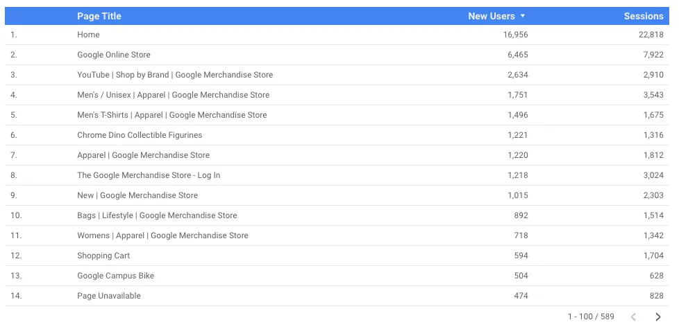
Tables
Tables display your data in a grid of rows and columns. Each column represents a dimension or metric, while each row is one record of your data.
Tables are stapling charts of Google Data Studio. They might not look appealing or attractive compared to other charts. But they will show all the "bones" of your data and they are really useful to troubleshoot any data source related issues.
They summarize your data. Rows in the table display the summary for each unique combination of the dimensions included in the table definition. Metrics in the table are summarized according to the aggregation type for that metric (sum, average, count, etc.).
Example:
Below you can see a basic and simple table, showing which pages in a website had how many new users and sessions.
Lead Generation Dashboard Examples
We at NorthStar Analytics, lead generation dashboards are our bread and butter. We assist businesses and marketers owners in collecting information from various channels and combining all of it into one dashboard. Your data is continuously updated, making it easy to analyze and build visualizations within minutes. Utilizing a dashboard system to consolidate and analyze your data could help you save between 10 and 40 hours each week.
Let’s see some lead generation dashboard examples.
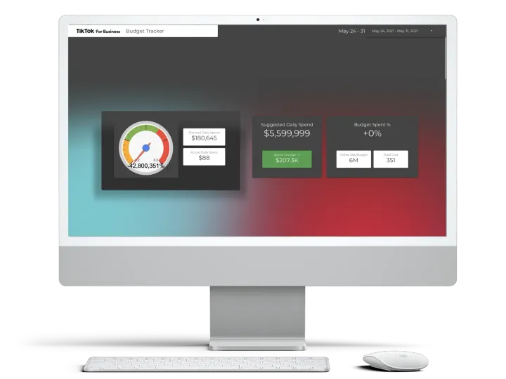
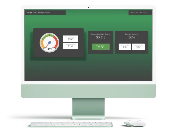
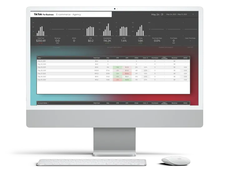
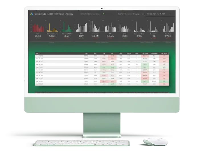
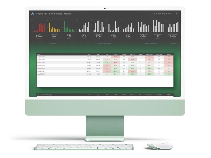
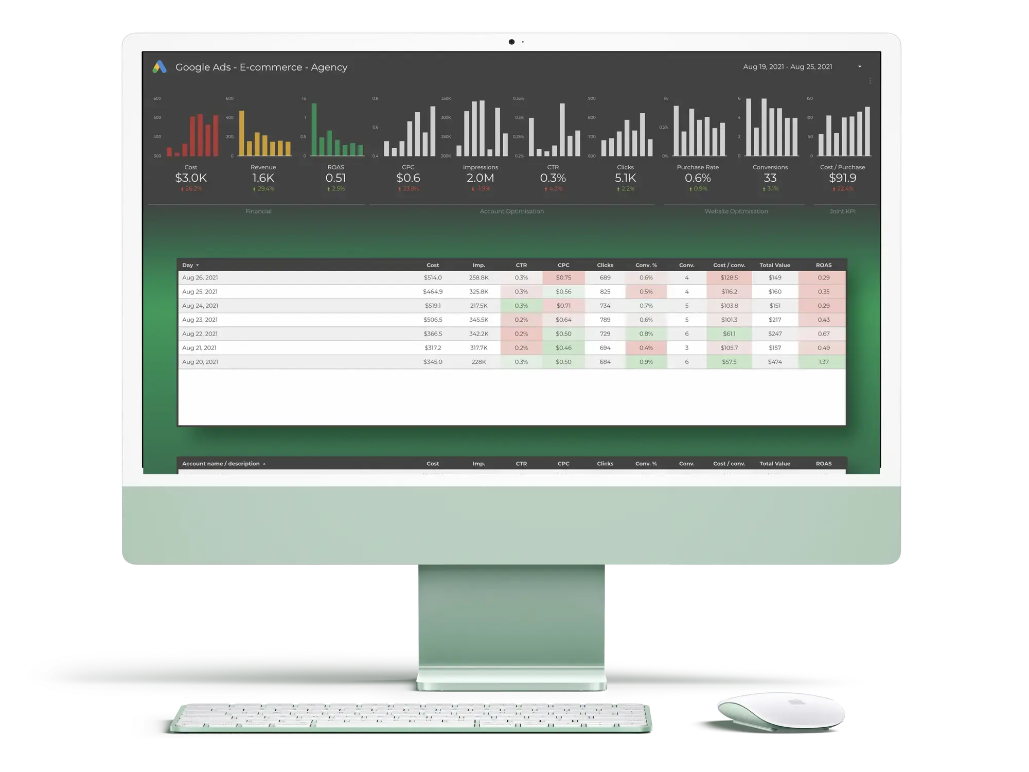
Google Ads Analyser Desktop Dashboard for Lead Generation
This is a Google Data Studio dashboard that works with Google Ads accounts. This dashboard visualizes raw and un-processed Google Ads data into easy to read, dynamic and smart charts and tables.
This dashboard offers all basic lead generation KPIs on a one-page design with an easy to read experience.
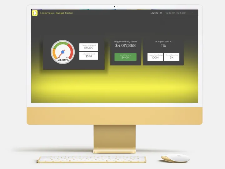
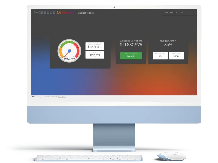
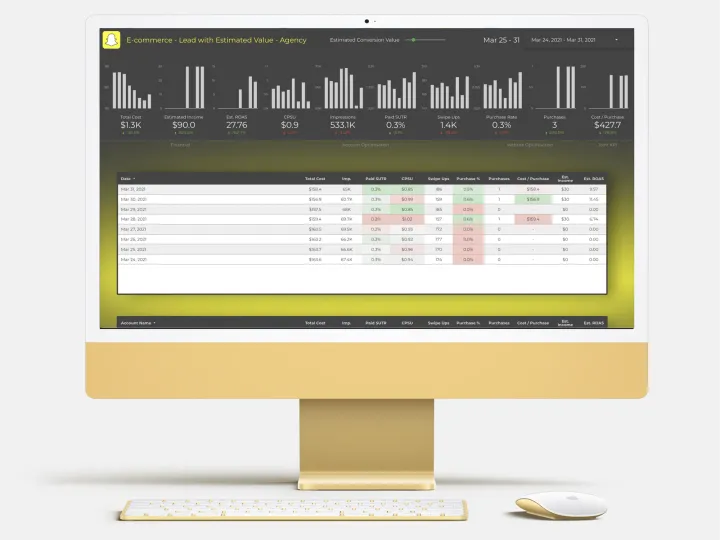
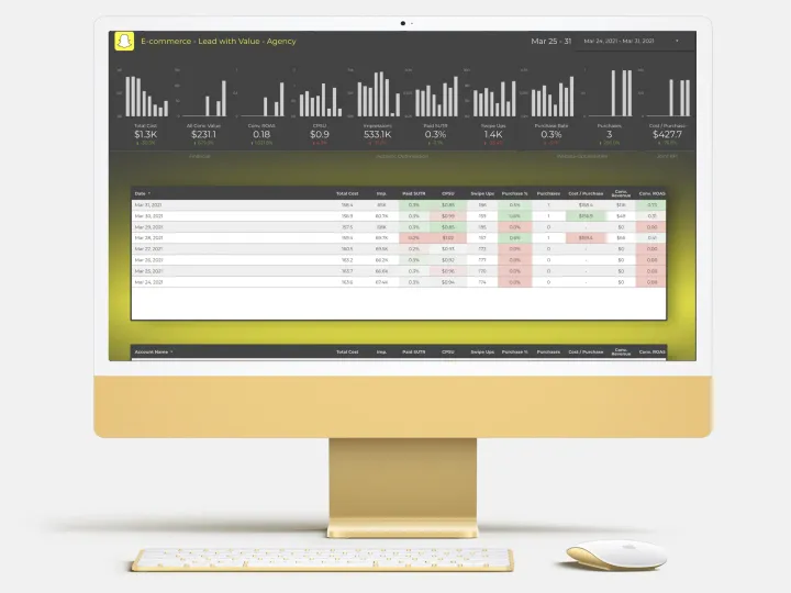
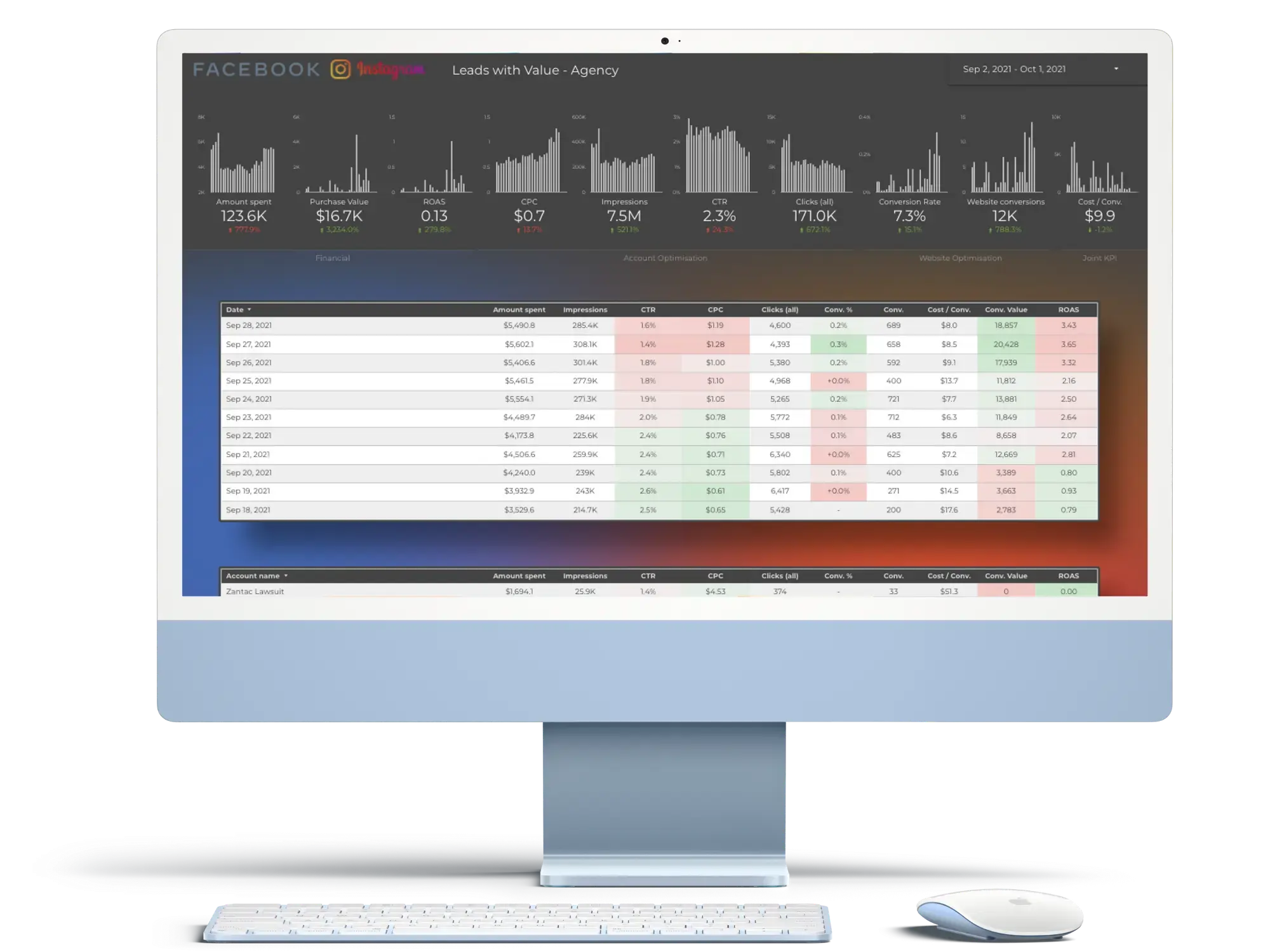
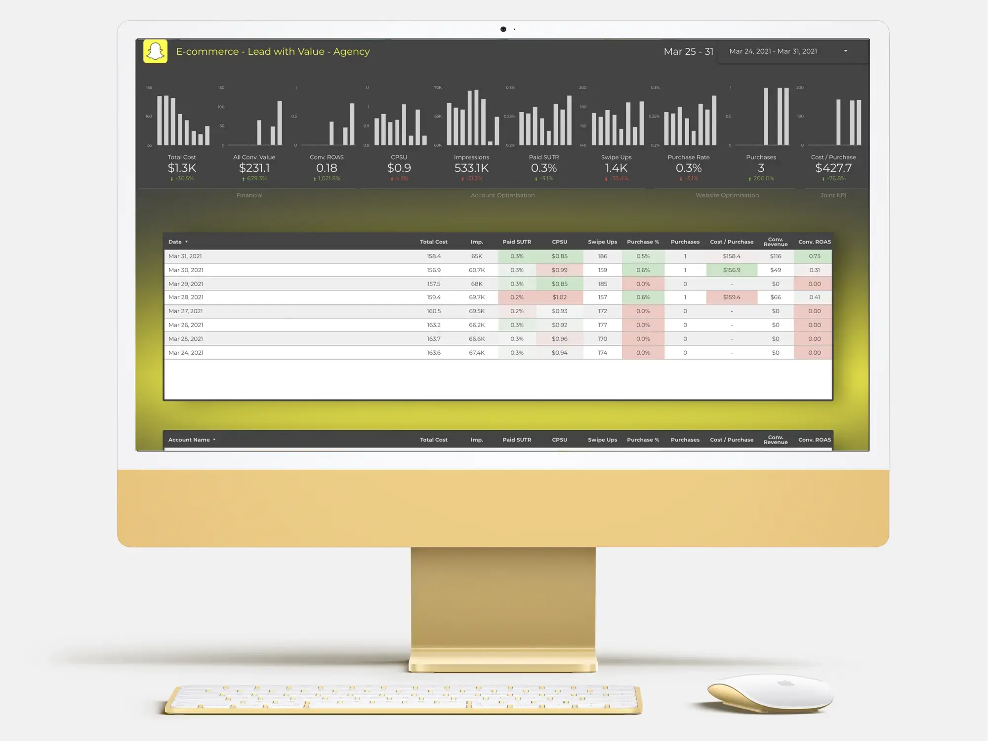
Facebook Ads Analyser Desktop Dashboard for Lead Generation with Estimated Value
This dashboard has a unique feature; it has all KPIs with “Facebook Ads Analyser Desktop Dashboard for Lead Generation” but there is a slider at the top of the dashboard called "Estimated Conversion Value". Dashboard users may change the value and this will automatically update other metrics on the dashboard. Users may ask "what if X conversion will bring Y revenue" and the answer will be on the dashboard!
Here is the Snapchat version of this dashboard.
Monitor these lead-generation KPIs now! It's not easy to categorize the KPIs by importance since each plays an integral contribution to the lead-generation process. Additionally, creating the best lead generation dashboard will consume your time along with your precious time.
Once you have figured out which KPIs you must utilize to assess the effectiveness of your marketing campaigns begins your free 7-day trial using NorthStar Analytics today.
Monitor and evaluate your lead generation KPIs automatically. It's long gone when you had to comb through tons of data and meticulously select every metric on many tabs. It's time to reclaim your time in the reporting process.