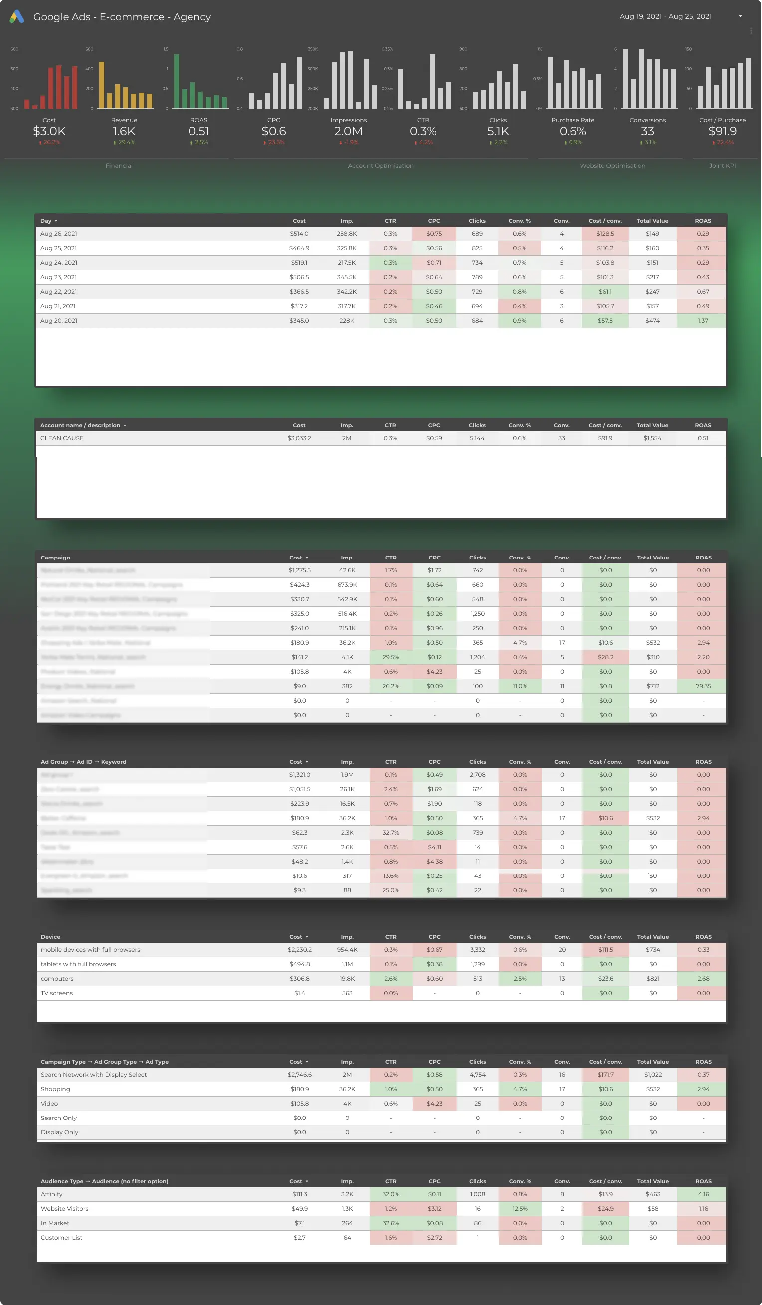
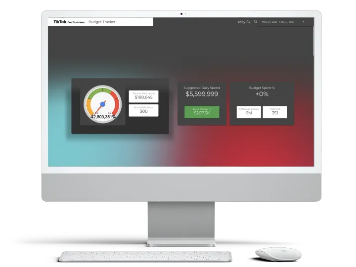
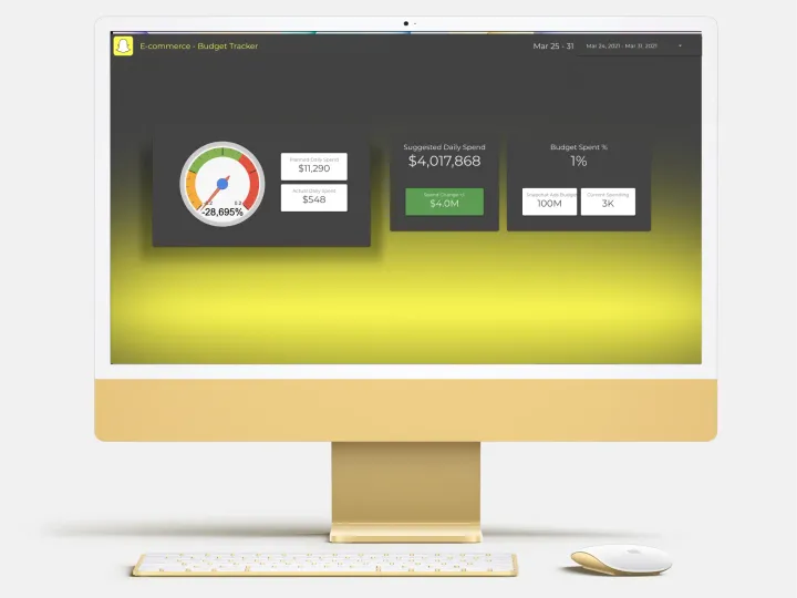
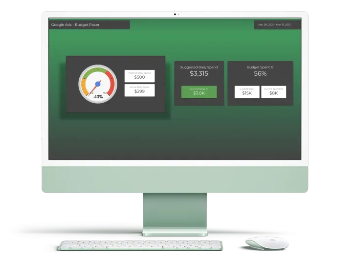
Google Ads Analyser Desktop Dashboard for E-commerce
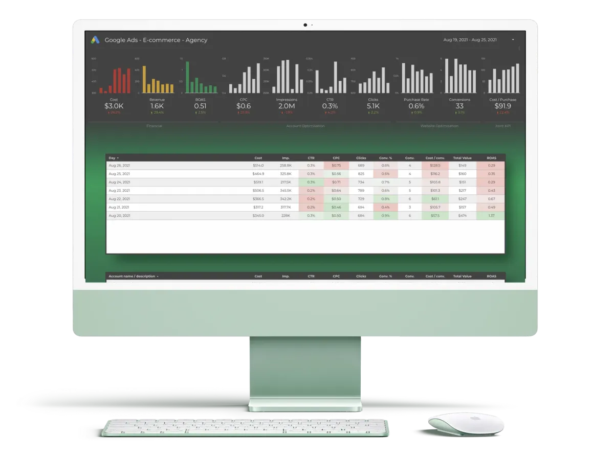
This is a Google Data Studio dashboard that works with Google Ads accounts or accounts. This dashboard visualizes raw and un-processed Google Ads data into easy to read, dynamic and smart charts and tables.
For Whom?
The Google Ads Analyser Desktop Dashboard for E-commerce is for agencies, digital marketing professionals and Google Ads experts whose goals are improving e-commerce value and increasing revenues generated from Google Ads campaigns.
What You Will Get?
You will get ownership of the Google Ads Analyser Desktop Dashboard for E-commerce. After connecting Google Ads accounts, you can start reviewing ads performance and KPIs right away. Charts and visual elements will be dynamic and reflect all historic Google Ads data within the account you will connect.
Possible Usage
This is an amazing tool to understand the ongoing performance of Google Ads campaigns.
- As an agency, you can use this dashboard to review key metrics from Google Ads campaigns, monitor your or your team's results and lead strategy to get better ROAS.
- You can create periodic e-mail reports in PDF format which can be delivered to your agency executives and/or clients.
- You can create partially custom dashboards with your clients' branding and sell them as an upgrade or extra service. This way, you can return your investment and include a new revenue funnel to your agency budget.
Included Dimensions and Metrics
This dashboard includes all the important dimensions and metrics, such as:
- Impressions
- Clicks
- Total Spend
- Click Thru Rate (CTR)
- Average cost per click (CPC)
- Conversions
Additional to these, custom KPIs tailored for e-commerce professionals, are also included. These fields are not native to Google Ads and are created with custom calculations.
- Revenue
- ROAS
- Purchase rate
- Cost / conversions rate
Design and Sections
The dashboard has 2 main sections:
Topline Metrics
These scorecards are located at the top of the dashboard with their distinctive bigger numbers and dedicated boxes. These are grouped according to Financial, Account Optimisation, Website Optimisation and Joint KPI themes. Each number has a comparison value below itself to give the user a sense of progress or change.
The line chart above the number field elegantly shows changes in time and helps users to put the latest value into perspective.