How to Use SPARKLINE Function in Google Sheets?

When working with Google Sheets, we sometimes show our table with the help of graphs for ease of reading. Graphs help us a lot for both ease of reading and analysis. Well, imagine that you made these graphs for the rows only, not for the whole table. This is great. We have individual charts for each product to analyze a sales list. Moreover, the graphics are fitted inside the cells. Also, you can find a detailed article about the graphics here→ “How to make a graph in Google Sheets?”
The types of charts we can make are as follows. Let's explain one by one in order.
We can make the following graphs with the SPARKLINE function.
- Line Chart
- Column Chart
- Win-loss Chart
- Bar chart
How to make a line chart with SPARKLINE?
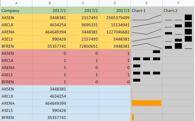
Let's start with the order on our table. I have data of companies for three periods. We can show this data for companies one by one with line charts.
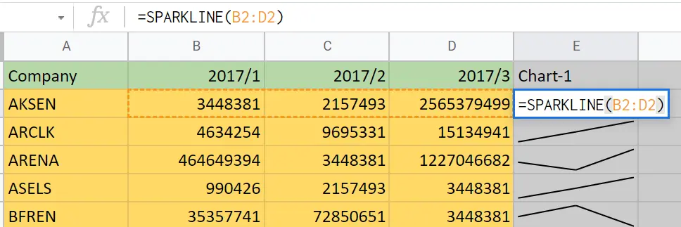
We create graphics for each row. For this;
- Come to the cell where you want the graph to be created.
- =SPARKLINE (cell range)
- When we create our graph for the 1st row, if we drag the small square on the lower right corner of the cell, graphs will appear in the other rows.
You can refer to this article to create a line chart containing the entire table→"How to make a line graph in Google Sheets?"
How to make a column chart with SPARKLINE function?
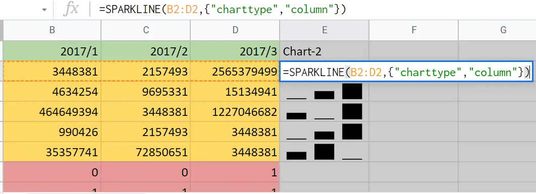
We create graphics for each row. For this:
- Come to the cell where you want the graph to be created.
- =SPARKLINE (cell range,{“charttype”,”column”})
- When we create our graph for the 1st row, if we drag the small square on the lower right corner of the cell, graphs will appear in the other rows.
- You can refer to this article to create a column chart containing the entire table→"How to make a bar graph in Google Sheets?"
How to make a win-loss chart with SPARKLINE function?
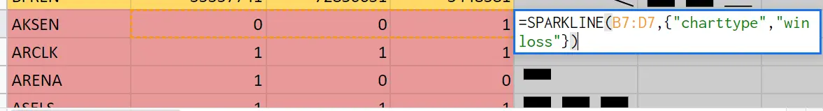
This chart type shows '0's as blanks and '1's as columns.
We create graphics for each row. For this:
- Come to the cell where you want the graph to be created.
- =SPARKLINE (cell range,{“charttype”,”winloss”})
- When we create our graph for the 1st row, if we drag the small square on the lower right corner of the cell, graphs will appear in the other rows.
How to make a bar chart with SPARKLINE function?
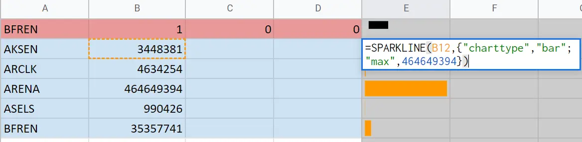
We may want to show the columns as bar charts according to their size. Here, it fills the bars according to the maximum value.
I entered the largest value in the data I have. For example, we might want to show the exam results according to the 100 system grades. Then we need to write 100 to the maximum value. If there are very large data, we can sort, copy and paste the largest value.
You can find a detailed article about the ranking here.→”How to sort in Google sheets?”
We create graphics for each row. For this:
- Come to the cell where you want the graph to be created.
- =SPARKLINE (cell range,{“chart type”,” bar”;” max”, X})
- When we create our graph for the 1st row, if we drag the small square on the lower right corner of the cell, graphs will appear in the other rows.
How to format charts?
How to format a line chart?
=SPARKLINE (cell range,{“color”,” green”;” linewidth”,4})
This both makes its color green and increases its thickness. Just write
=SPARKLINE (cell range,{“color”,” green” ”;” linewidth”, X) for the color.
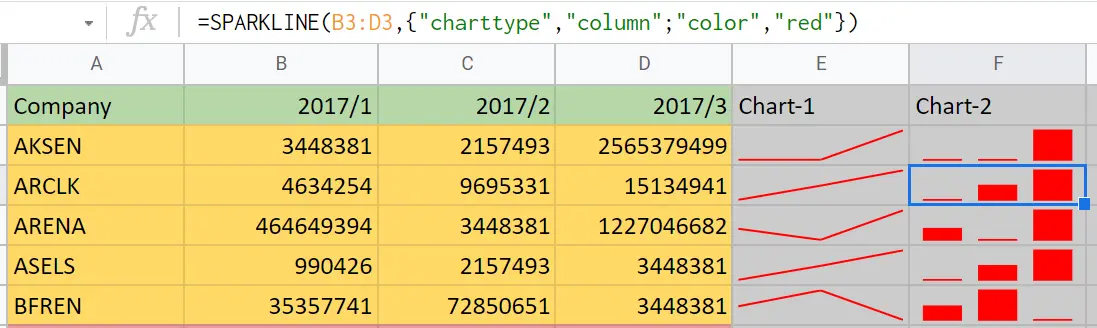
How to format a column chart?
=SPARKLINE(B2:D2,{"charttype","column";”color”,”red”}) or ;
=SPARKLINE(B2:D2,{"charttype","column";”color”,”blue”;”lowcolor”,”red”;”highcolor”,”green”})
High values are shown in green and low values in red. Those in between are shown in blue.