How to Make a Bar Graph in Google Sheets

It is exhausting to just look at the data in the table and comment. In this article, we will delve into bar charts, one of the charts making the work easier.
How to Make a Bar Chart?
It can be done from the toolbar, as well as from the menu. The most important point for both of them is the correct choice of cells belonging to the data we want to be in the chart. Since we want to know which data belongs to what on the chart, we need to include the titles.
How to Make a Bar Chart Using Menu?
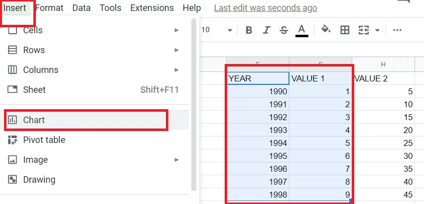
- Choose the data you want to become a chart (including the titles)
- Menu->Insert->Chart
How To Make a Bar Chart Using Toolbar?
- Choose the data you want to become a chart (including the titles),
- Click on the “insert chart icon” on the toolbar
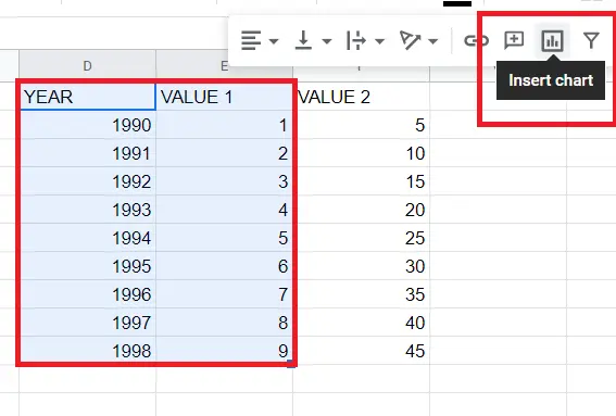
Here I have selected only two columns. Things will change a bit when I choose more than two columns. I will explain that part shortly.
3. When we click on the "insert chart”, I automatically get a line chart. You can double-click on the chart and change it to a bar chart on the screen that comes up.
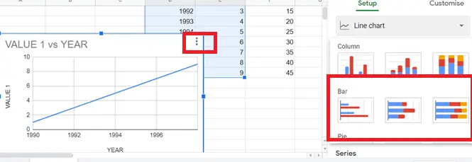
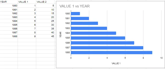
Here are our bar charts.
What Are the Types of Bar Charts?

1. Bar Chart
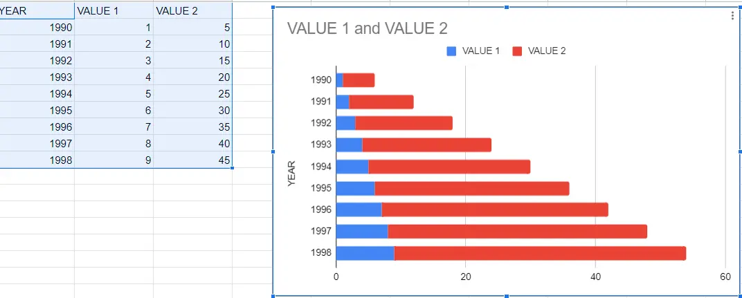
2. Stacked Bar Chart
3. 100% Stacked Bar Chart
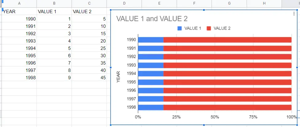
The difference between Stacked Bar Chart and 100% Stacked Bar Chart is:
- In the stacked chart, the graph shows the values of variables normally. But in 100% Stacked, the table shows the percentage of one value to another.
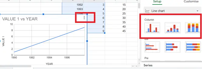
How to Make a Column Chart?
As you can see, the bar charts go from left to right, and column charts go from bottom to top. Follow the same steps to create a column chart.
How to Combine a Bar Chart with Other Charts?
We may want to combine the bar chart with other charts. In cases like this, use a column chart.
- Choose the data you want to become a graphic (including the titles)
- Menu->Insert->Chart or click on the “insert chart icon” on the toolbar
Google Spreadsheet automatically gave us a "Combo Chart". If another chart is given:
- Double click on the chart, select the "combo chart" from the screen that comes up.
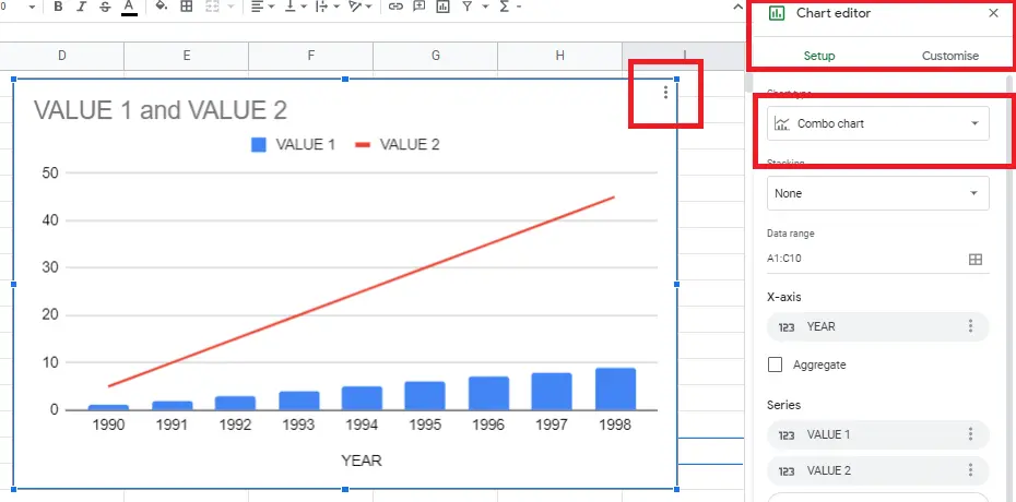
That's it! The bar chart and line chart are created!
How to Setup and Customize Bar Charts in Google Sheets?
We may want to make changes to the chart we created. We can use the graphic editor to change its settings like color and size of graphics etc. You can find detailed information about this in the article "How to make graphs in Google Sheets" .


