How to make graphs in Google Sheets?

The larger the data, the harder it is to interpret. Graphs help us to get rid of this problem. Creating charts in Google Spreadsheets is pretty easy. Let's take a look at the content before moving on to the instructions.
What are graphics used for?
The types of charts we want to use change according to the data we have and what we want to examine. E.g.If we want to examine the relationship and direction between our two variables; scatter plot, we can use a line chart to see how our data changes over time. Now let's take a look at how the graphics are created.
How to make a graph?
There are two ways to make a graph;
- From Menu
- From the “Insert chart” icon in the toolbar
Let's take a look at the menu first.
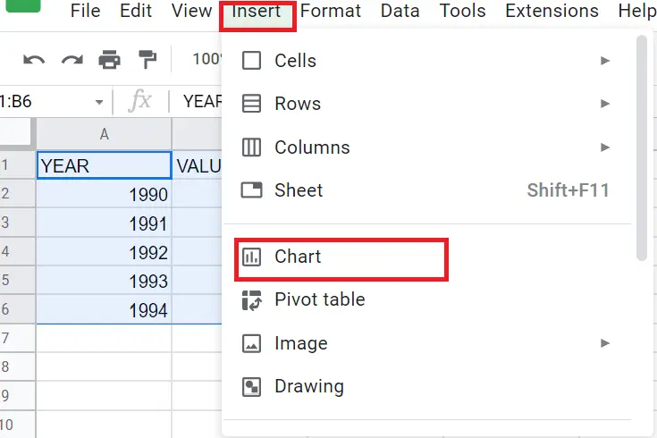
How to make a chart using the menu?
- Select the cells belonging to the data whose graph we want to create. (Including the headings)
- Menu->Insert->Chart or
- Click on the “insert chart icon” on the toolbar
Now let's do it with the icon in the toolbar.
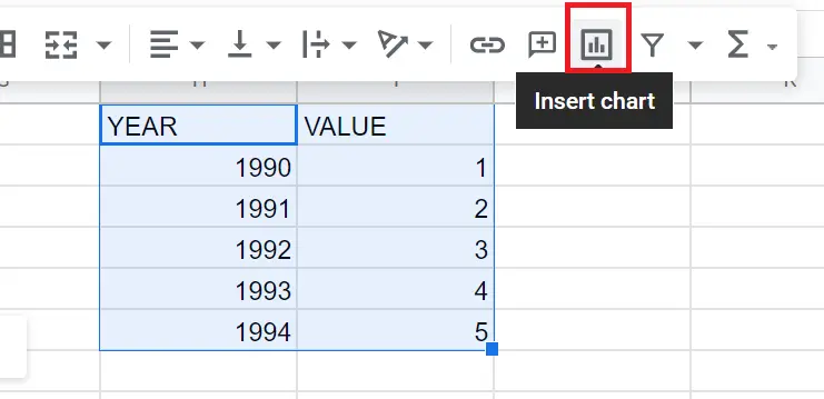
How To Make Chart Using Toolbar?
- Select the cells belonging to the data whose graph you want to create. (Including the headings)
- Click the “chart icon” in the toolbar
How to customize charts in Google Sheets?
The graphics are created. But as it is created automatically, the data it demonstrates might be wrong at times. To fix the graphics, we need to change the variables manually. To do this, double click on the graph and see the screen below.
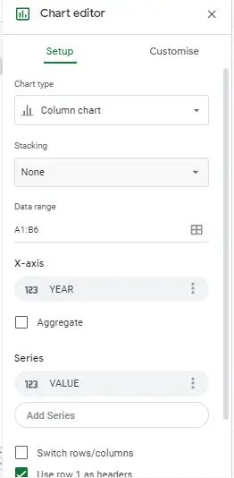
What could be done from this window?
You can
- change the chart type, determine the position of the graphic on the screen (we need to change the cells),
- change the variables on the X and Y-axis of the chart,
- make changes in the colour settings of the graphic (background, graphic lines, etc.),
- change the fonts in the chart (title, variables, values, etc.).
Chart Editor Glossary
- Chart type: When you select the data and click on the chart, an automatic chart appears. You can choose the chart type you want.
- Data range: You can make changes in the data ranges of the chart.
- X-axis: You can specify the locations of the variables on the axes.
- Series: Here you can intervene in the series selections you made before making the chart.
- Switch Rows/Columns: Swaps rows and columns.
- Use row 1 as headers: Selecting data, it uses whatever the first row is as the header. Since we included the titles when we were choosing, it automatically used them as titles.
- Use columns as labels: Takes the first column you selected as a label. Since it is selected automatically, it appears when making the graph.
CHART STYLE
- Smooth: Makes the graphic lines smooth.
- Maximize: Reduces the gaps on the edges of the graph and enlarges the graph.
- Plot null values: Adds the empty values in the data you use to the chart.
- Compare mode: Provides additional information when hovering over a data value. You can hover the mouse over one of the data points and take a look at it.
CHART AXIS AND TITLES
You can change the titles (subtitles, axis titles), font, font size, text colour of the chart.
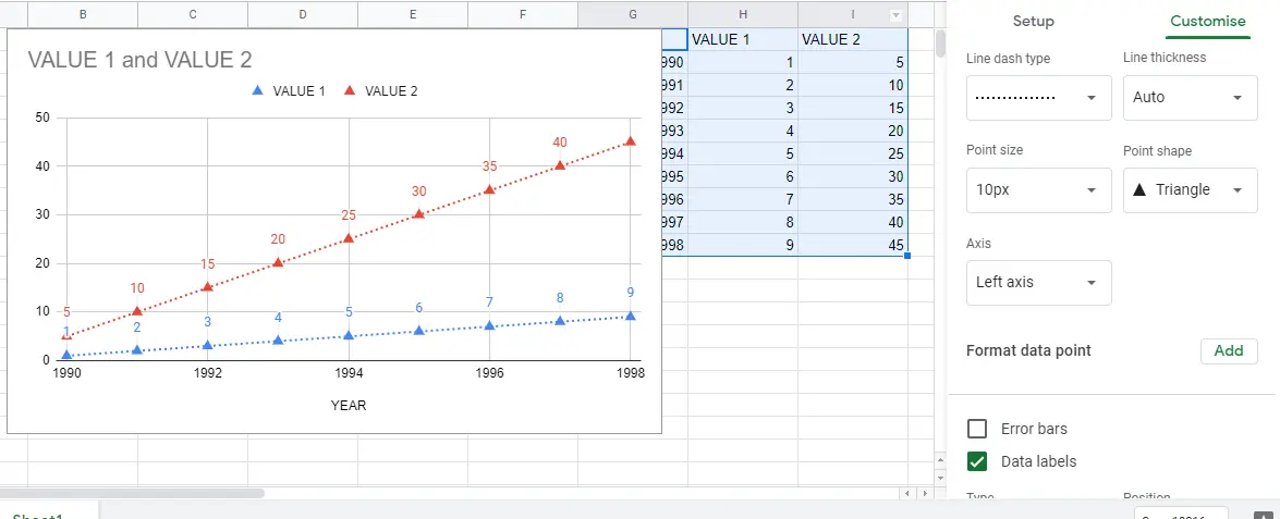
SERIES
In this tab, you can
- change the line properties of the chart (dashed, straight),
- add features such as dots and triangles to the chart,
- change the opacity and colour settings in the chart,
- combine two graphs as bar chart and line chart.
LEGEND
You can change the position of the chart, the font of the variables, the colour and the font.
HORIZONTAL AXIS
In addition to the minimum and maximum values that the graphic will take, you can make changes regarding the horizontal axis, font, size, colour, scale factor, etc. properties from here.
VERTICAL AXIS
On the vertical axis, you can make the same changes made on the horizontal axis.
GRIDLINES AND TICKS
We can make changes (colour, thickness, etc.) to the borderlines in the graphic.
Additional Customisations
Let's delve into the screen showing up after clicking on the three dots in the upper right corner.
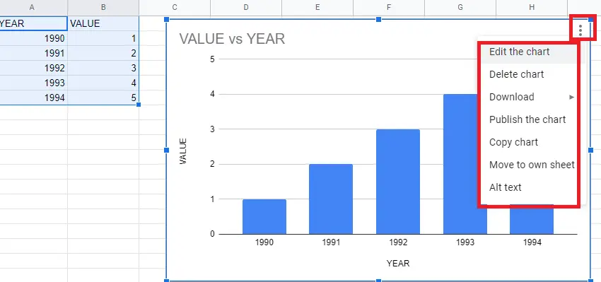
- Edit chart: When double-clicked on the chart, it gives the screen that appears.
- Delete chart: Removes the chart.
- Download: Prints the graphic as png, pdf, SVG.
- Publish the chart: This allows us to share the chart.
- Copy Graphics: You can copy the graphic to a new sheet in the same format.
- Go to own page: Opens a new page for the graphic. This way a new sheet will be created with only the graphic available and there will be no data on this new sheet.
- Alt text: This is an option that provides descriptions for those who have difficulty reading graphics.


