How to make a histogram in Google Sheets?

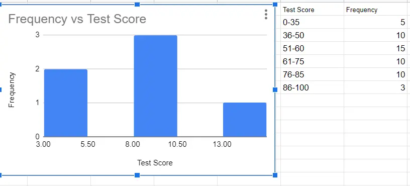
Histogram charts are used to see the distribution of data in statistics. It shows the distribution of numbers according to certain groups. In other words, it divides numerical data into groups according to frequency. It is similar in appearance to column charts. The difference is that in the bar chart, there is a Y value corresponding to the x-axis, whereas in the histogram, the values on the X-axis are put in boxes called 'bins'. It is these boxes corresponding to Y.
How to make a histogram?
A histogram can be created from the toolbar and menu. The most important point here; is the selection of the data we want to be graphic. We have to make sure we choose the right range of cells. It's important to include headings in the cell selection. We need to know what we are showing on the axes.
How To Make Histogram Using Menu?
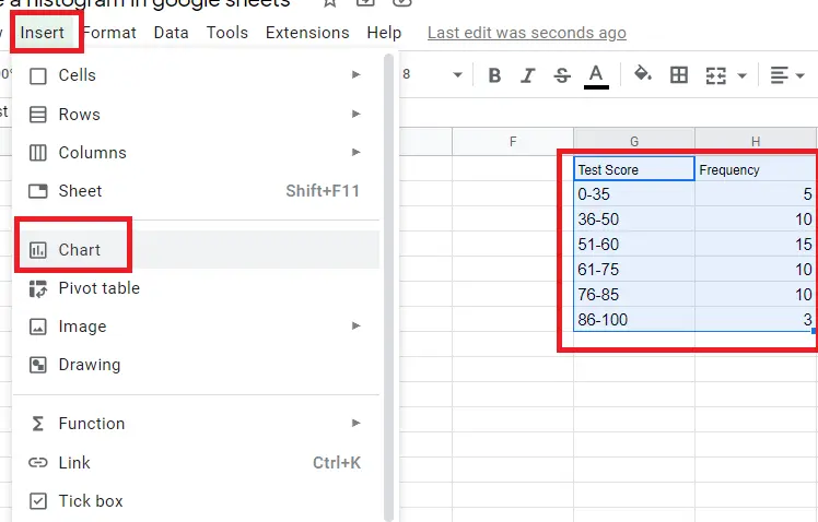
- Select the cells belonging to the data whose graph we want to make (including the headings).
- Menu->Insert->Chart
How to make a histogram using the toolbar?
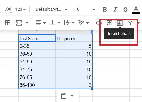
- Select the cells belonging to the data whose graph we want to make (including the headings).
- Click on the “insert chart icon” on the toolbar.
An automatic chart appears. To change this:
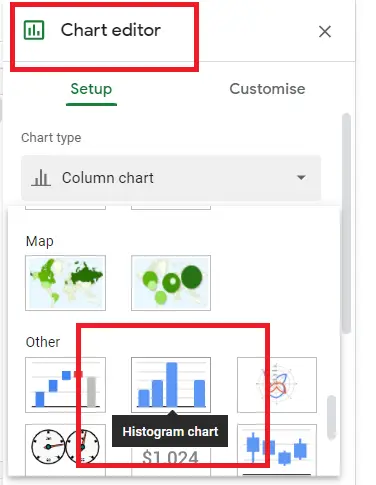
- Double-click the chart. ( Chart editor)
- Chart editor->Setup->Chart Type-Histogram
The histogram is ready! Now we can make changes to it.
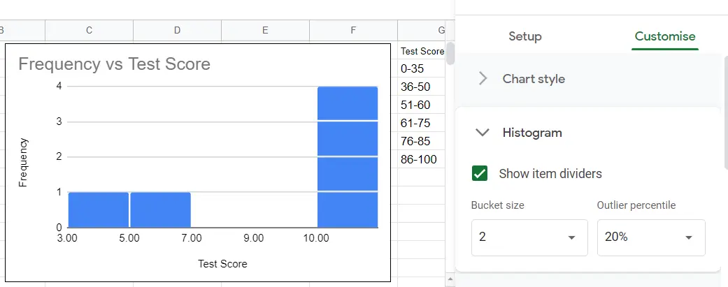
How to customize a histogram chart?
When the histogram is created, 'histogram' appears in the chart editor. From here you can make changes to the bucket.
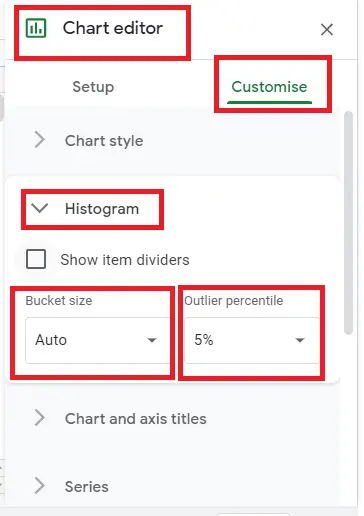
You can adjust the bucket sizes, bucket spacing, percentile of the buckets, colors, font, size, etc. from the graphic editor. You can find detailed information on this in the "How To Make A Graph On Google Pages?" article.