How to make a line graph in Google Sheets?

A bar chart is the best when it comes to displaying time-series data since it is the easiest-to-understand graphic. Bar chart shows the change of a variable over time and it has a very common usage.
What is a line chart used for?
Change of the multiple data can be analyzed at the same time by using lines of different colors and patterns For instance, you can show your sales data of different categories in the same graphic and make comments. When quarterly sales data is shown in the same graph, it can be seen which sales are continuous and whether they are periodic.
How to make a line chart?
We can do it from the toolbar as well as from the menu. The most important point here; is the selection of the data we want to be graphic. We have to make sure we choose the right range of cells. It's important to include headings in the cell selection. We need to know what we are showing on the axes.
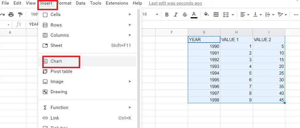
- Choose the data you want to create a chart with (including the titles)
- Menu->Insert->Chart
How to make a line chart using the toolbar?
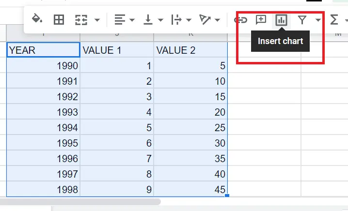
- Choose the data you want to create a chart with (including the titles)
- Click on the “insert chart icon” on the toolbar
When you execute the steps mentioned above in order, a bar chart will appear successfully.
The graphic type, however, may not always automatically be a chart. In this case, you need to double-click on the chart and change the graphic type to a bar chart or; you can click on the three dots in the upper left corner of the chart, click edit chart and change it from there.
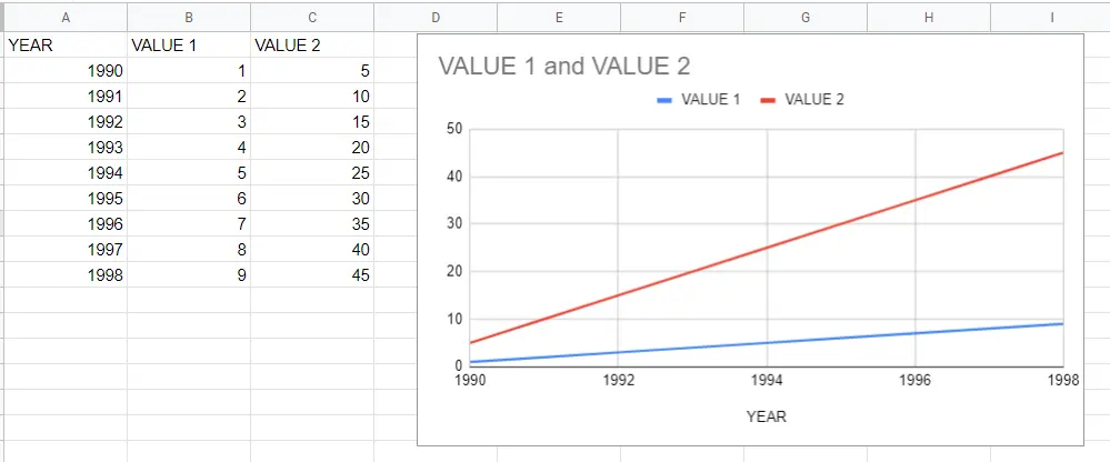
That's it! Our chart has become a bar chart according to the values in the table. The table has two variables since we selected two variables here. You can decrease or increase these choices.
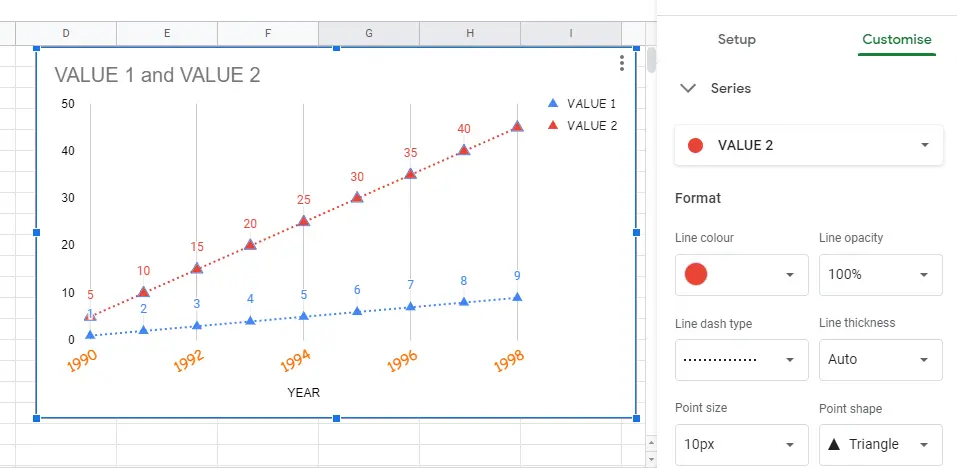
How to customize line charts in Google Sheets?
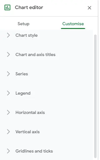
You may want to make changes to the graph created. You can:
- change the colour and size of the graphic,
- determine the minimum and maximum values it will receive,
- combine it with other chart types,
- add a point on the line graph to be decisive, and many more other changes.
In order to make changes, use the graphic options that come up when double-clicking on the graphic. ->Chart Editor
You can find other changes that can be made to the chart in the article "How to Make a Chart in Google Sheets?".


