How to make pie charts in Google Sheets?

The pie chart helps a lot if you have a data set with categorical variables. The pie chart shows how the category slices are distributed proportionally. Let's look at how it is made and the types of it.
How To Make A Pie Chart?
We can do it from the toolbar as well as from the menu. The most important point here; is the selection of the data we want to be graphic. We have to make sure we choose the right range of cells. It's important to include headings in the cell selection. We need to know what we are showing on the axes.
How To Make Pie Chart Using Menu?
- Choose the data you want to make a pie chart (including header).
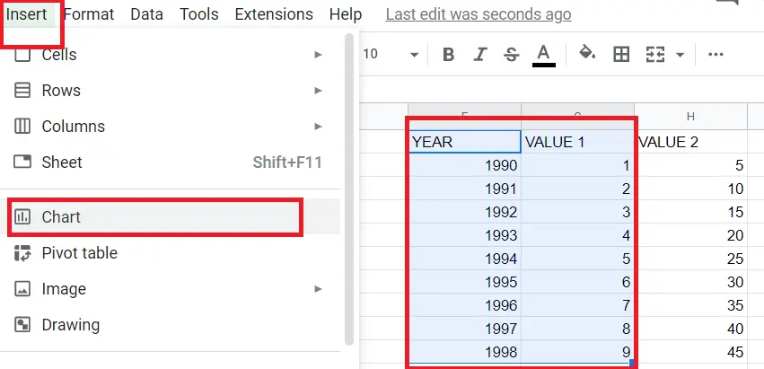
- Menu – > Insert- > Chart
How to make a pie chart using a toolbar?
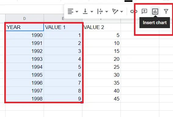
- Choose the data you want to make a pie chart (including header).
- Click on the chart icon from the toolbar.
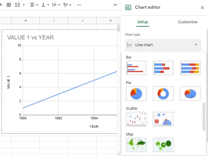
If a line chart comes up when you click on the make a chart button, you can double-click on the chart and select a pie chart from the chart editor.
What Are the Types of Pie Chart?
There are 3 types of charts.
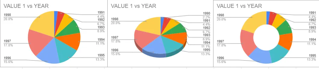
1-Pie chart
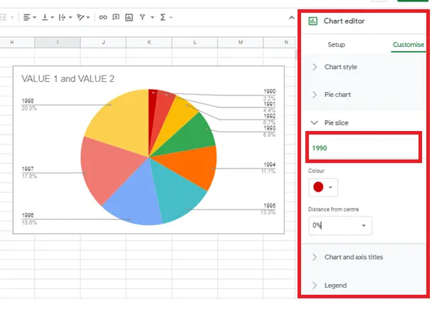
You can make changes to the pie chart from the chart editor section. You can change the colour of the slice chosen, separate it from the pie, and print its values on it.
2-3D pie chart
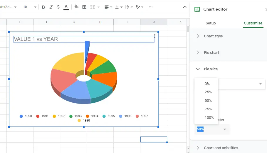
The same changes can be made in 3D pie charts from the chart editor.
3-Doughnut Chart
You can either choose the chart from the chart types or make it manually from the chart editor. You can enlarge or shrink the middle of the chart, change the font and colour of it and print values on it.

How to set up and customize pie charts?
You may want to make changes to the graph created. A graphic editor can be used to change its settings such as the colour and size of graphics. Please find detailed information about it in the "How to make graphs in Google Sheets?" article.


