How to make scatter plots in Google Sheets?

Graphs come in handy in interpreting the data better. A scatter chart is one of the tools helping us make different inferences about the data distribution.
What is a scatter plot?
A Scatter plot is one of the most helpful graphics to understand the relationship between two variables.
For example, what is the relationship between air temperature and ice cream sales? What is the relationship between height and weight?
In this article, we will analyze the relationship between ice cream sales and temperature.
How to make a scatter plot?
A Scatter plot can be created from the toolbar as well as from the menu. The most important point here; is the selection of the data we want to be graphic. We have to make sure we choose the right range of cells. It's important to include headings in the cell selection. We need to know what we are showing on the axes.
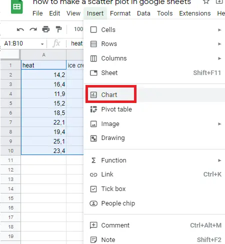
How to make a scatter plot using a menu?
To make scatter plot graphics:
- Choose the data you are interested in (including headers).
- Menu –> Insert –> Chart
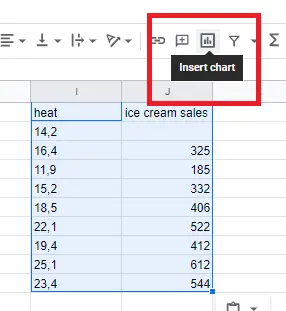
How to make a scatter plot using a toolbar?
- Choose the data you are interested in (including headers).
- Click on the “insert chart icon” on the toolbar.
When you select the data and add a graph, an automatic graph appears. If the graph is not a scatter chart, you can make it a scatter chart by double-clicking the chart and changing it.
Chart editor-> Setup->Chart type
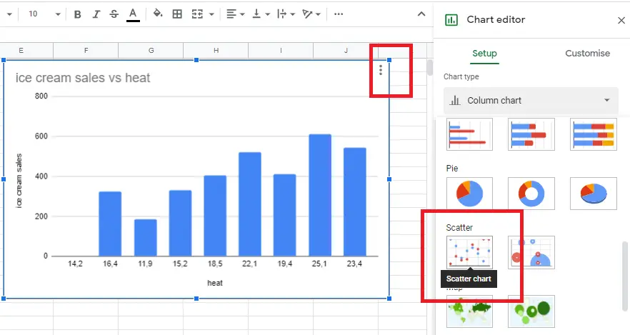
The scatter plot is created!
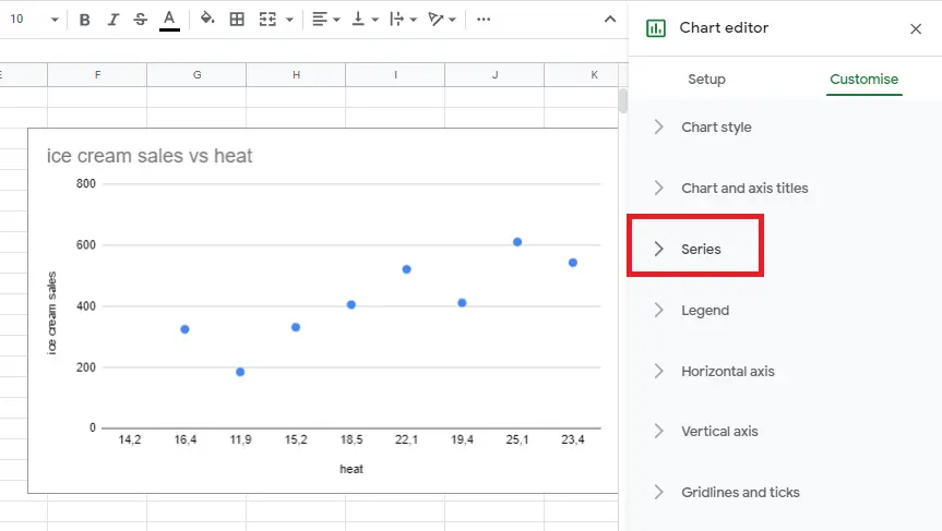
How To Add a Trend Line to A Scatter Plot?
The scatter plot helps us understand the relationship between variables, but we need to add a trend line to understand the direction of the relationship.
Go to Chart editor –>Series section-> add a trend line.
Therefore, we can have more information about the direction of the relationship.
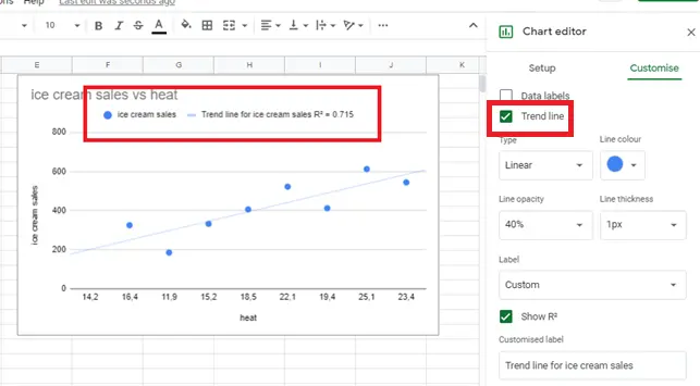
After adding the trend line, we now have a better idea about the relationship between ice cream sales and air temperature. The trend line also gives us an idea about the outliers besides the direction between relations. There are no discrete values in our example. R² here gives us information about outliers. R² being close to 1 indicates that its values are in good agreement with each other.
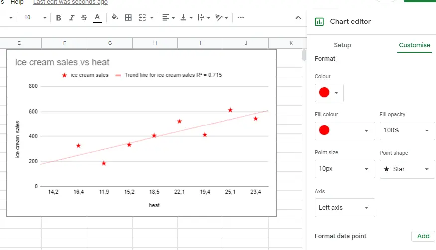
How to set up and customize scatter plots?
We can change the color, size, and other settings related to the trend line and scatterplot on Graphic Editor by double-clicking on the graph.
You can find other graphic changes in detail here “How to make a graph in google sheets?”.


