How do we visualize data with Power BI?
Data visualization enables you to transform any complicated data into easily digestible, aesthetically pleasing, and practical business information.
Your data may include significant insights that can help you advance your business. However, the issue is that by simply looking at the numbers alone, we are unable to make connections.
When you examine your data in a visual format, you can identify models, relationships, and other insights that will open up new possibilities for you after you have the answer. Otherwise, you might not be interested in these thoughts.
Data visualization gives data meaning and enables you to communicate the narrative of the insights buried inside your numbers. The utilization of live data dashboards, interactive reports, charts, graphs, and other visual displays, along with other visual displays, allows users to swiftly and effectively generate insightful business decisions.
Power BI visuals are eye-catching charts that can be utilized to bring your data to life. Images boost knowledge, retention, and engagement while facilitating the more effective sharing of data insights. Images are an important part of your reports because they help your audience connect and interact with information so that they can make informed decisions quickly.
Once you've loaded and modeled the data from your company in Power BI Desktop, you're ready to start creating your reports.
You can start reading my articles about getting data and modeling in Power BI by clicking on the links below.
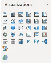
A variety of graphics are available in Power BI for reporting on the information in your data model.
In the Visualizations tab of Power BI Desktop, an icon stands in for each graphic. Charts, maps, cards, tables, matrices, and many other types of images are available.
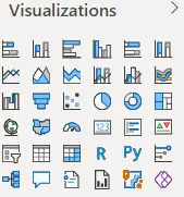
By choosing a different image from the Visualizations window when the image is selected, you can modify the visualization type.
Numerous pre-built visualization choices are available in Power BI Desktop and can be used immediately from the Visualizations pane. Once you've decided which sections to include in your visualization, you may experiment with all the different types to see which one best meets your requirements. If you can't locate an image that meets your requirements, you can import your own unique images or get additional images from Microsoft AppSource.
To ensure that you are presenting the data in the best way possible, it is crucial to select an effective visualization.
Here is the post that will instruct you on how to select the best image for your data.
How to import a Power BI custom visual?
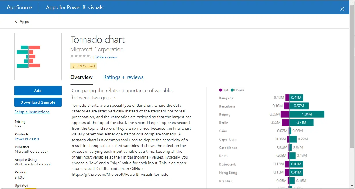
Hundreds of other developers have produced a multitude of graphics in addition to the ready-to-use visualizations in Power BI Desktop. You're probably going to find it in the market if you have a specific image in mind. Power BI allows you to construct your own graphic if you can't locate one.
Microsoft and Microsoft partners produce the custom pictures that are made available on Microsoft AppSource. These unique pictures come in both certified and uncertified varieties. When a visual is certified, it means that it has been tested to ensure that it has no access to external services or resources, that it complies with secure coding patterns and rules, and that it satisfies the Microsoft Power BI team code requirements.
Note: For reasons of security or for other factors, some businesses decide against using bespoke pictures. Ask your company if importing bespoke photos is permitted before you do so. You can still create reports using custom graphics in Power BI Desktop even if they aren't supported; however, they won't appear in the Power BI service.
The custom visual software development kit (SDK), an open source tool based on NodeJS (JavaScript programming language), is available on GitHub and can be used to design your own custom visual. You can import the custom visual into Power BI Desktop as a single Power BI Visual Tools (.pbiviz) file.
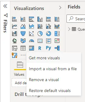
Select the Get more images icon in the Visualizations window, and then click Get more visuals.
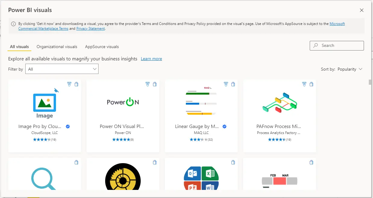
Find and pick the image you wish to import in the window that pops up, and then click the Add button.
In the Visualizations tab, the new image is shown alongside other images.
To include the image in your report, select the image's icon. The image can then have fields added to it, and its formatting can be altered just as with any other image.


