What are Power BI data visualization tools and which visualization should we choose to according to our data?
Table and Matrix visualizations
A table is a grid with linked information organized logically into rows and columns. The table can include headers and rows for totals, and it supports two dimensions.
Similar to a table visualization, a matrix visualization shows data. Nevertheless, it gives you the option to pick one or more matrix elements (rows, columns, or values) to highlight in cross-hatch other photos on the report page.
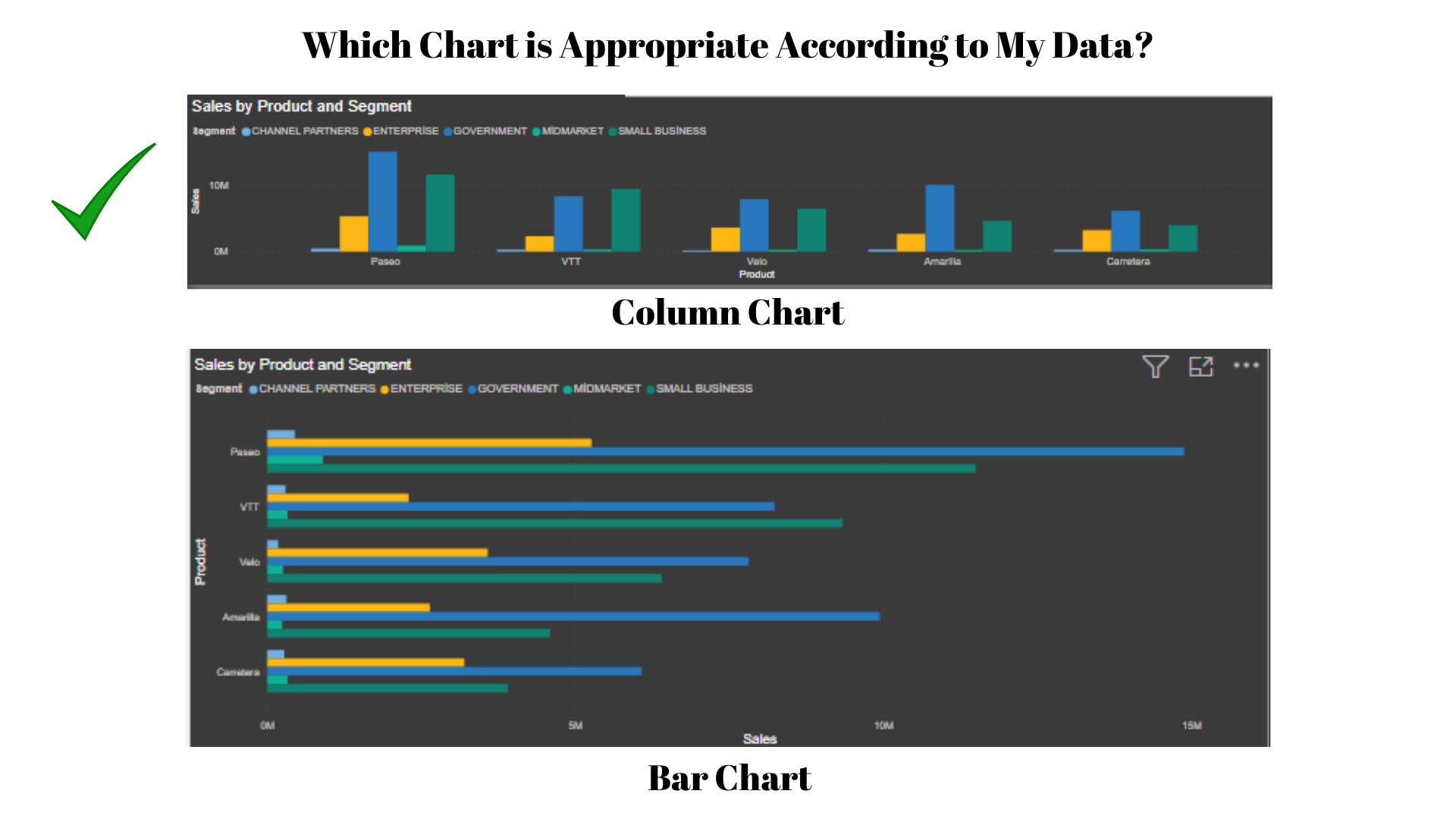
Bar and column charts
A range of bar and column chart visualizations are available in Power BI Desktop and present certain data from several categories in a stacked or aggregated fashion. The stacked format layers pieces of information on top of one another.
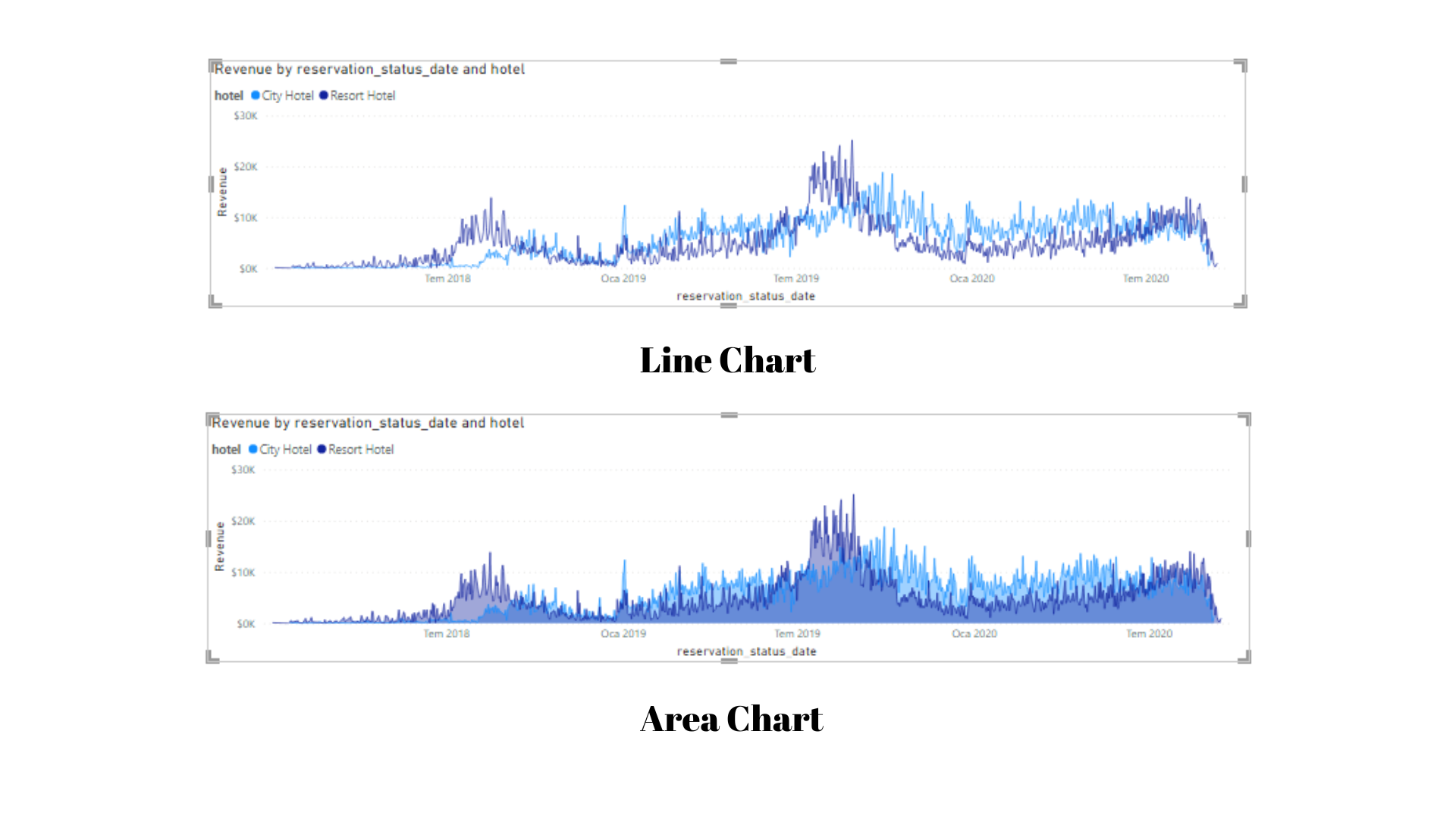
Line and area charts
You may illustrate patterns over time with the use of line and area charts. A line chart with the area between the solid axis and the line forms the basis of a simple area chart. The area chart emphasizes the size of change over time, which is the primary distinction between these two types of charts.
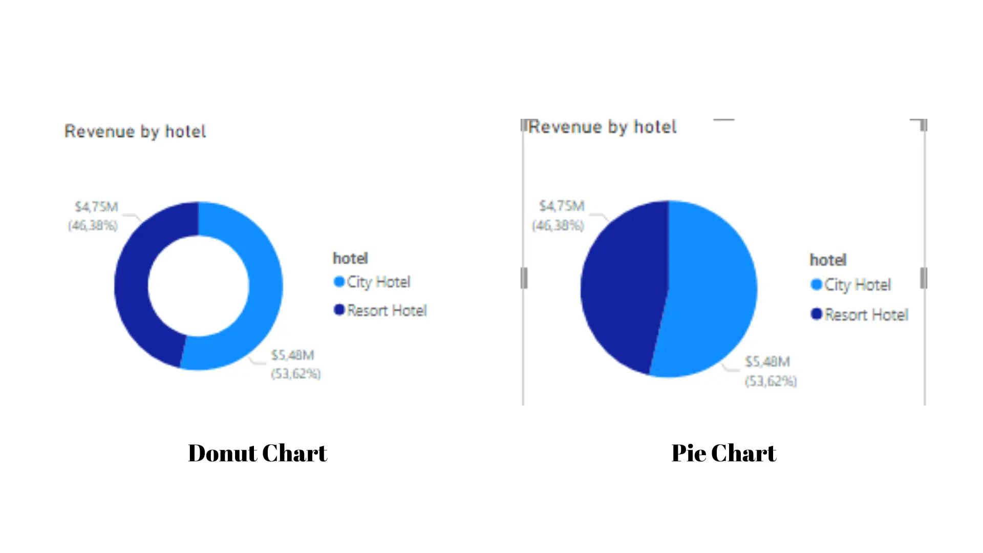
Pie chart, donut chart, and tree maps
The data is divided into portions and shown using a pie chart, donut chart, or tree map to show you how the parts relate to the total. These charts are useless from a data analysis standpoint since the data they display can be challenging to understand. However, due of the vibrant parts they portray, these images are widely employed for aesthetic purposes. These graphs work well when displaying percentages, such as the top five sales by nation or product, or other applicable categories.
A pie chart is a flat circle, whereas a donut chart has an empty center where a label or icon can be placed.
Avoid offering too many categories when using Pie charts, Donut charts, and Tree maps as this will lead to thin slices that do not benefit the user. Use a different graphic kind, such a column chart, if you need to display every category in your dataset.
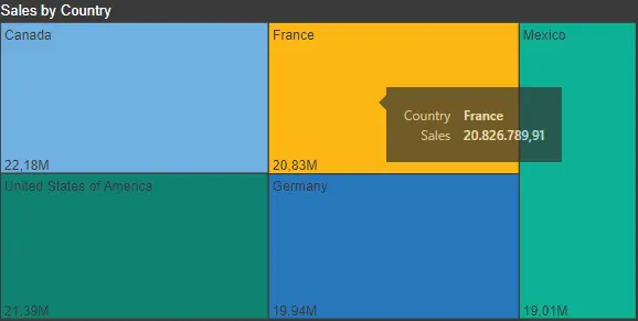
Pie charts and donut charts divide the data into slices while the treemap visualization displays it as a collection of nested rectangles. A colored rectangle made up of smaller rectangles represents each level of the hierarchy. Each rectangle's area is divided by its measured value basis. The sizes of the rectangles are organized from top left (biggest) to bottom right (smallest).
The tree map is the best tool for seeing:
- Massive amounts of hierarchical data for which the bar chart is unable to handle many values.
- Parts separating the parts from the total.
- Calculate the pattern distribution at each level of the hierarchy's categories.
- Color-coded size and attribute categories.
- Spotting trends, extremes, top contributors, and outliers.
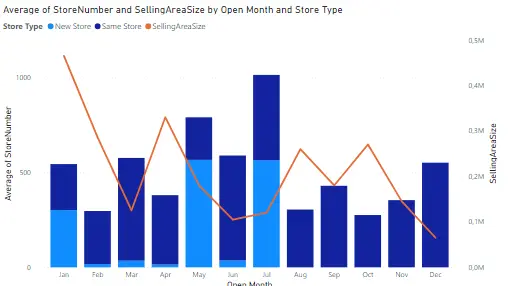
Combo graphs
A column chart and a line chart with one or more Y-axes are combined to create a combo chart visualization. When the two charts are combined, you can:
- Comparing several measurements with various ranges of values.
- Visualize the relationship between two measurements in a chart.
- Check to see if a measure achieves the goal set by another measure.
- saving page space for your report.
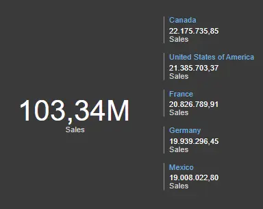
Card visualization
One value, or one data point, is displayed in the card visualization. The essential facts in your Power BI dashboard or report, including total value, YTD sales, or year-over-year change, are best visualized using this sort of visualization.
One or more data points are displayed on the multi-line card visualization, one for each row.
Funnel visualization
The funnel representation depicts a linear process with successively connected stages in which items flow one after the other.
In business and sales situations, funnel charts are most frequently used. It works well, for instance, to show how a workflow progresses from a sales lead to a nomination and from a quote to a sale.
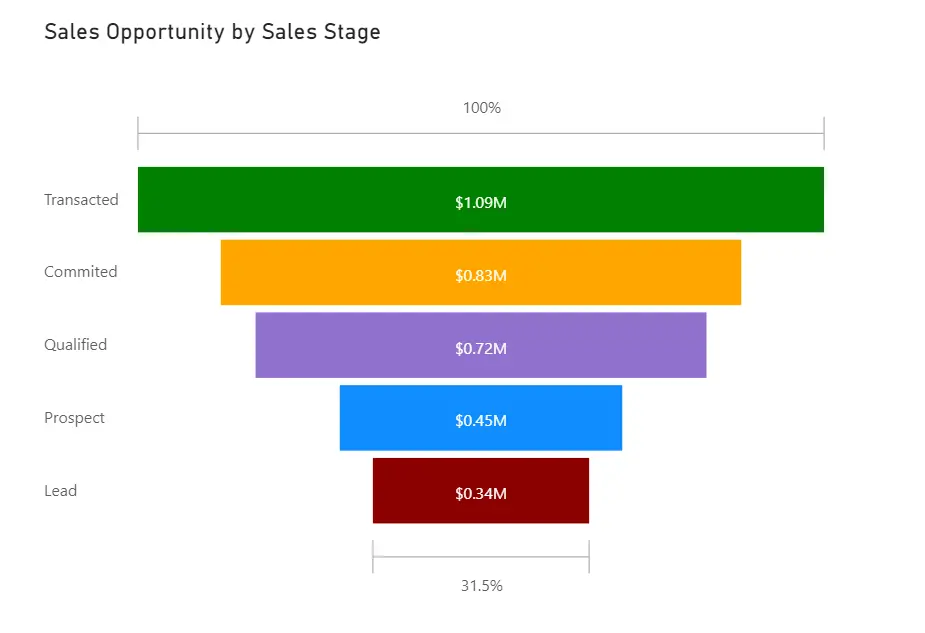
For the following situations, funnel charts are excellent choices:
- There are at least four stages in the data's sequential nature.
- It is anticipated that there will be more items in the initial stage than in the final stage.
- Calculating potential outcomes in accordance with stages, such as income, sales, agreements, etc.
- Determine and track retention and conversion rates.
- Exposing problems with performance in a linear process.
Gauge chart
The circular arc of the radial gauge graph shows a single value that represents progress made toward a goal.
The default maximum value, which is always double the actual value, is displayed as the value at the end of the arc. You need to always provide each value in order to get a realistic image. You can complete this task by leaving the target value, lowest value, and maximum value fields in the visualization pane with the appropriate field and an amount.
Progress towards this objective is represented by the shading in the arc. The progress value is represented by the value in the broadcast. From lowest (leftmost value) to highest (rightmost value), Power BI uniformly distributes all available values throughout the arc (rightmost value).
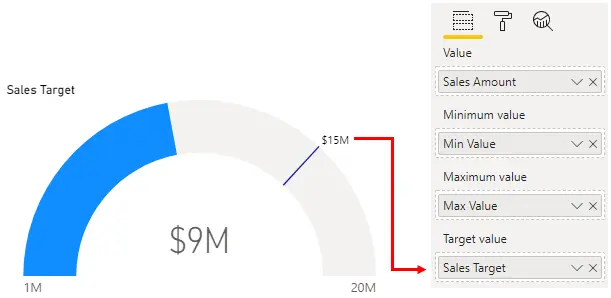
Radial gauges can be used to display the state of a single gauge or to illustrate progress toward a target. Radial gauges, however, occupy too much area in relation to the information they offer. It is more effective to have two gauges with a Spark row so that consumers can observe the trend and know what to do about it.
Waterfall visualization
The waterfall visualization, which is helpful when illustrating a succession of positive and negative changes, depicts an ongoing sum as the addition or subtraction of values. To make it simple to see gains and declines, the chart's columns are color-coded. In contrast to the first and end value columns, which frequently begin on the horizontal axis, the midway values are flowing columns.
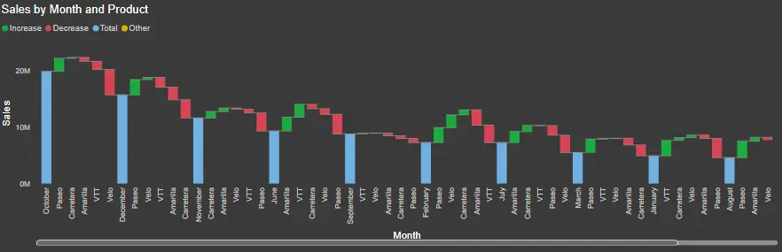
Uses for waterfall charts include:
- Seeing alterations throughout time or between several categories.
- Looking for significant changes that affect the overall value.
- Plotting your company's annual earnings while illuminating different revenue streams to estimate total profit (or loss).
- Display the starting and ending personnel count for your company over the course of a year.
- Making a visual representation of your monthly income, expenses, and account balance.
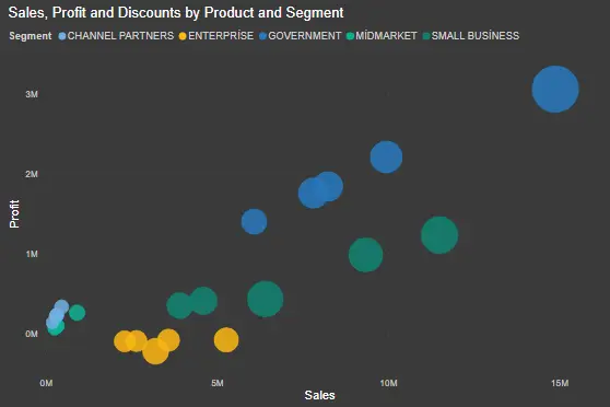
Scatterplot
Without time constraints, scatterplot visualization is useful for comparing a lot of data points. The scatter chart displays two value axes. The first one is a collection of numerical information on a horizontal axis, while the second one is a collection of numerical values on a vertical axis. The chart displays the points where the X and Y numeric values cross and aggregates these values into a single data point. Depending on the data, these data points may be placed either equally or unevenly along the horizontal axis. A maximum of 10,000 data points can be specified.
Instead of using a line chart, consider using a spread chart since you may alter the scale of the horizontal axis.
Furthermore, scatter plots let you:
- Illustrate the connections between two numerical numbers.
- Drawing a single sequence of x and y coordinates from two sets of numbers.
- Change the scale on the horizontal axis to logarithmic.
- Showing study data in pairs or with grouped value sets is prohibited.
- Display huge data patterns, including linear and nonlinear trends, clusters, and outliers.
- Analyzing numerous data points without time constraints. The scatterplot allows for better comparisons the more data you add to it.
In the example below, an ascending trendline and a scatterplot with outliers (anomalies) are shown. The graph unequivocally demonstrates that only a small number of products are sold in bigger quantities, while the majority are sold in the same quantity. You can conduct a more thorough analysis and divide them into different nations and regions by finding these outliers. Consequently, you may boost customer satisfaction, lower expenses, and enhance logistics.
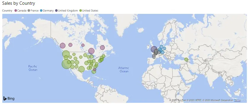
Maps
You can build maps using the default map coordinates provided by Power BI's integration with Bing Maps. They work together to employ algorithms to find the right place, though sometimes that's only a best guess.
To link quantitative and categorical data to spatial locations, a basemap (bubble map) is employed. As seen in the figure below, this kind of map image shows the exact geographic positions of data points on a map. A fill map shows how a part varies across a region using shading, tints, or patterns. Similar to how color-coded shapemaps compare various geographic regions relative to one another. An ArcGIS map can also be used to more interactively present graphical data.
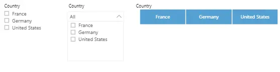
Slicer visualization
The slicer visualization is a standalone image that can be used to filter other images on the website. Compared to the Filters pane, which is ideal for more fundamental filtering tasks, Slicers offer a more sophisticated and personalized filtering mechanism.
Slicers can be formatted to allow choosing one, most, or all of the available values and come in a variety of forms, including lists, dropdowns, and buttons.
Slicers are ideal for:
- Making critical or often used filters visible in the report canvas for faster access.
- Making it easier for you to view the current status of filtering without having to use the drop-down list.
- Applying a filter to data tables' hidden or unused columns.
- By putting slicers next to crucial photos, you can create reports that are more focused.
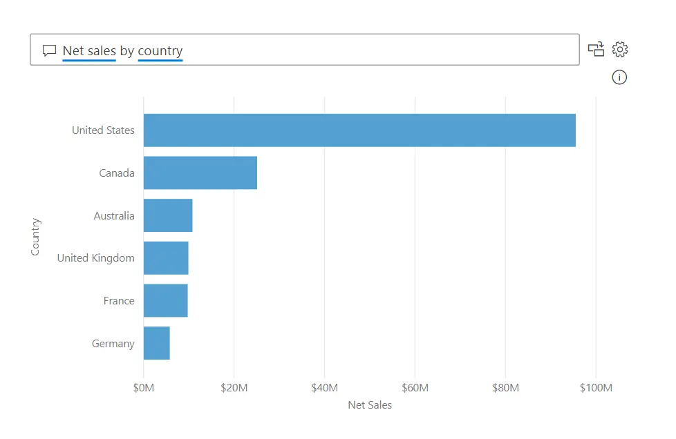
Q&A visualization
You can ask questions using natural language and receive visual responses thanks to Q&A visualization. As a report writer, having the capacity to probe is advantageous to both readers and yourself. This kind of visualization can aid in the creation of a visual in the report and be utilized as a tool to elicit feedback from customers.
The following four essential elements make up the Q&A visualization:
- A question area where users can enter their queries as well as answers to the questions.
- A pre-populated list of possible queries.
- A button that allows users to change the Q&A image to a regular image.
- A user-selectable icon that launches the Q&A tool and enables designers to modify the underlying natural language infrastructure. You can define the type of image in your query when using Power BI Q&A to enter natural language questions.