How to Format and Configure Visualizations in Power BI?
You may choose from a variety of customization choices in Power BI Desktop to alter the color and format of the text that appears in the visualizations you select. To understand how each selection will affect the final image, you'll need to spend some time investigating your possibilities.
To open the Format pane, first, choose the visualization on the canvas.
then choose the Format button (the paintbrush icon).
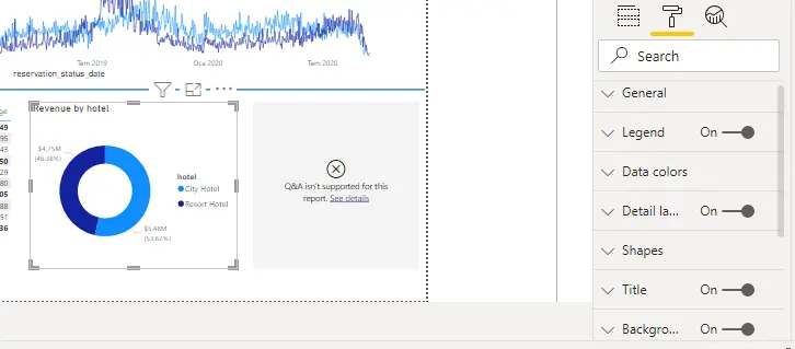
Depending on the sort of visualization you choose, there are several formatting possibilities.
Title, Background, and Border are common formatting options. If the image does not already have a title, you can update the title in the Title area. The title's objective is to accurately describe the information shown in the image. The content, text size, font, color, background, and alignment of the title can all be customized.
- General
If there is an image on your canvas, you can specify its precise dimensions and placement here. If the drag-and-drop function doesn't position the image exactly where you want it, this option may be helpful. It can also be used to ensure that specific images are consistently aligned.
- Background
You can choose any color or picture to serve as the image's background in this section. If you intend to utilize a background image, try to avoid selecting one with lines or other shapes that might make it challenging for viewers to comprehend the data. The data should be placed on a white background for optimum visibility.
- Data Colors
You can select the colors you wish to use for the data values in the image under the Data Colors section. When choosing these colors, you can use various hues for various spaces, but you should always aim to maintain consistency. The report should ideally have a consistent color pattern.
- Data Labels
You can alter the font, size, and colors of each label in the image in the area devoted to data labels. So that the labels can be seen easily, try to utilize solid colors. Use dark gray or black, for instance, if the background is white, to make your labels stand out.
- Tooltips
Based on the report pages you developed in Power BI Desktop, the Tooltips section lets you build a customized tooltip that appears when you hover over the image. Tooltips are a useful feature since they provide the data points in the image with more context and detail. The data point's value and category are shown in the tooltip by default, but you can add collections of photographs, individual images, or other objects to the custom tooltips that you build on the report page.
- Border
To make it simpler for the user to see and comprehend the data, you can put a border here to demarcate the image from other items on the canvas. You can alter the border's color and width to match your color scheme.
You'll see that the visualization updates instantly to reflect any changes you make in the Format pane. Select Restore to Defaults for each area in the Format pane if you need to reverse the modifications you've made.


